Overview
Client: Digital news outlet Cambio Colombia.
Project: News platform migration, UI refinement, design system creation, and subscription UX redesign.
My role: Design Lead and Product Designer, leading research, end to end UX and UI design, and design new features.
Team: Frontend developer, backend developer, cross functional stakeholders (editorial, marketing, sales, SEO, support), reported to a manager.
Scope: Consolidate multiple tools into a single platform, redesign subscription flow, UI/UX improvements, create a design system.
Timeframe: 2024-2025.
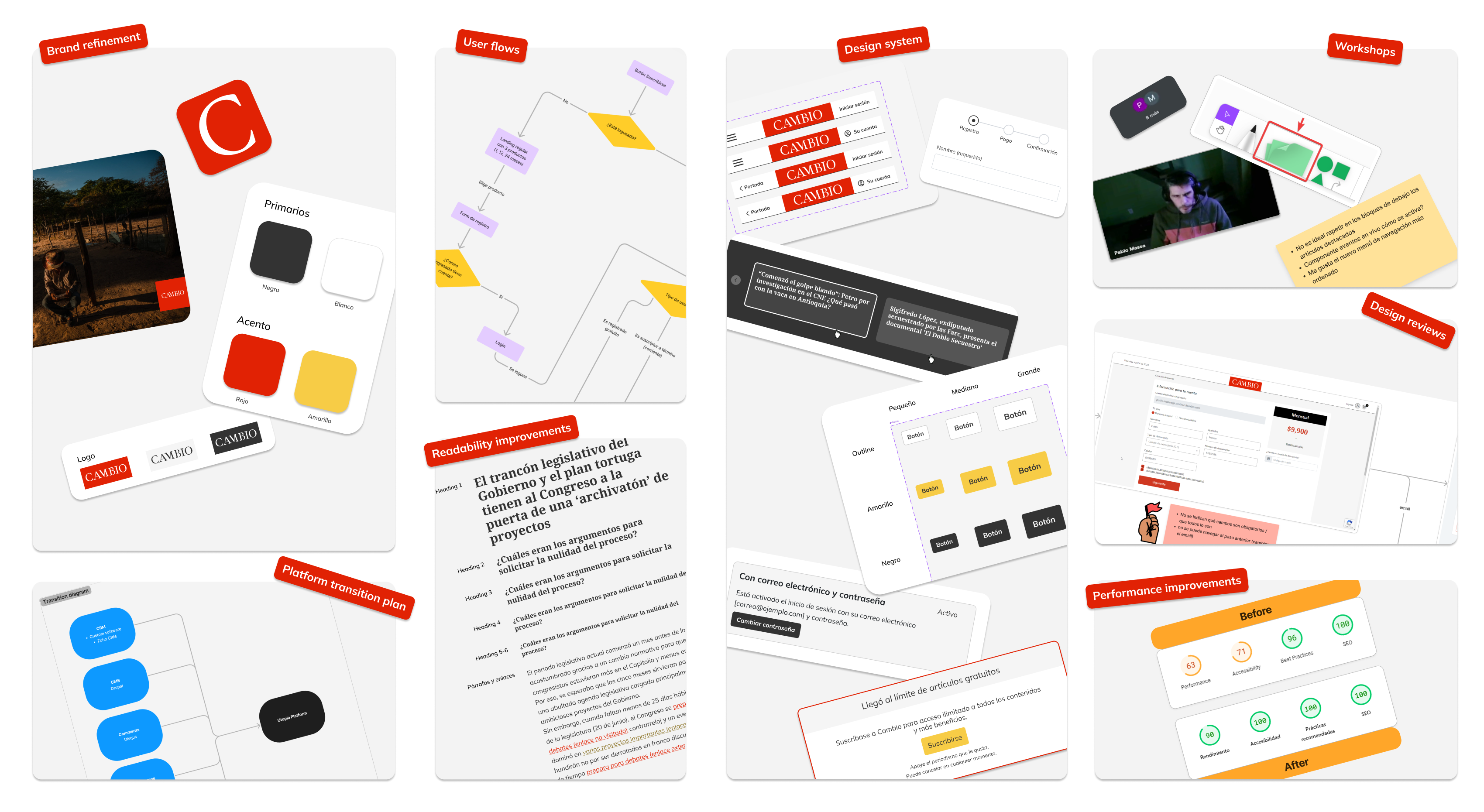
Key project highlights
Context
The product relied on a fragmented stack of third party services and legacy systems. This increased costs, operational complexity, and UX inconsistency across the reader and subscriber experience.
The organization aimed to reduce this fragmentation and improve the overall user experience.
Goals
Business goal: Reduce operational costs through platform consolidation into the Utopía platform and increase subscription revenue through UX improvements.
Product goal for readers: Improve the paywall & subscription flow experience through clarity and reduced friction, while enhancing performance, SEO, and UI consistency through a scalable design system.
Product goal for internal teams: Consolidate publishing, subscription, and user management into a single platform to simplify workflows for editorial, marketing, sales, and support teams.
My role
As Design Lead and Product Designer, I owned the UX direction and UI decisions across the migration. I coordinated delivery across engineering and stakeholders, and ensured design intent was implemented through documentation and design QA.
Key responsibilities
- Led research, discovery, diagnosis, and prioritization
- Defined the target experience and migration plan
- Alignment with editorial on information architecture and UI refinements
- Alignment with SEO experts on URL structure, redirects, and rollout risk
- Supervised implementation with frontend and coordinated constraints with backend
- Delivered UX/UI improvements and full redesigns where needed
- Built the design system used for the new platform
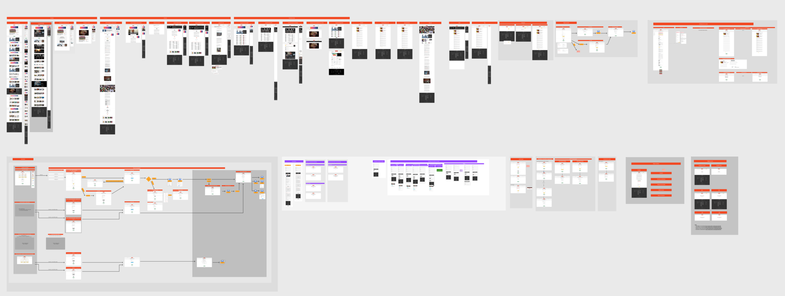
- Created 40+ high-fidelity screens in Figma, fully built with the new design system
My tools
Discovery & Research


Design & Optimization
UI Design + Design System
- Figma Design for high fidelity, design system & dev handoff
- Frame0 for occasional wireframes
- v0 & Lovable for occasional sketches and prototypes of UI concepts


Accessibility, SEO & Performance


Team collaboration


Discovery and diagnosis
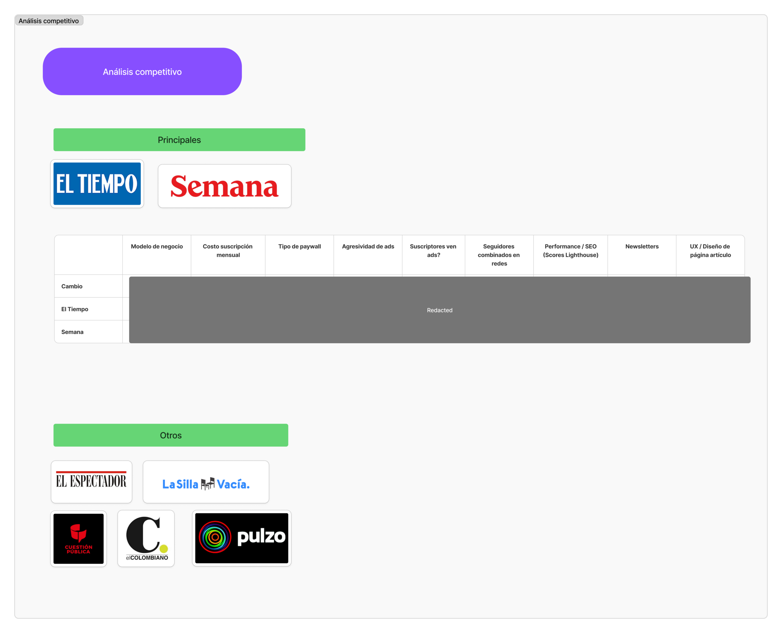
Research inputs
- Competitive research of subscription based news sites
- Design review of the existing site and key user journeys
- Stakeholder interviews (editorial, marketing, sales, SEO, support, managers)
- Analytics review (Google Analytics, Marfeel)
What I documented
- Competitive landscape of Colombian digital news platforms
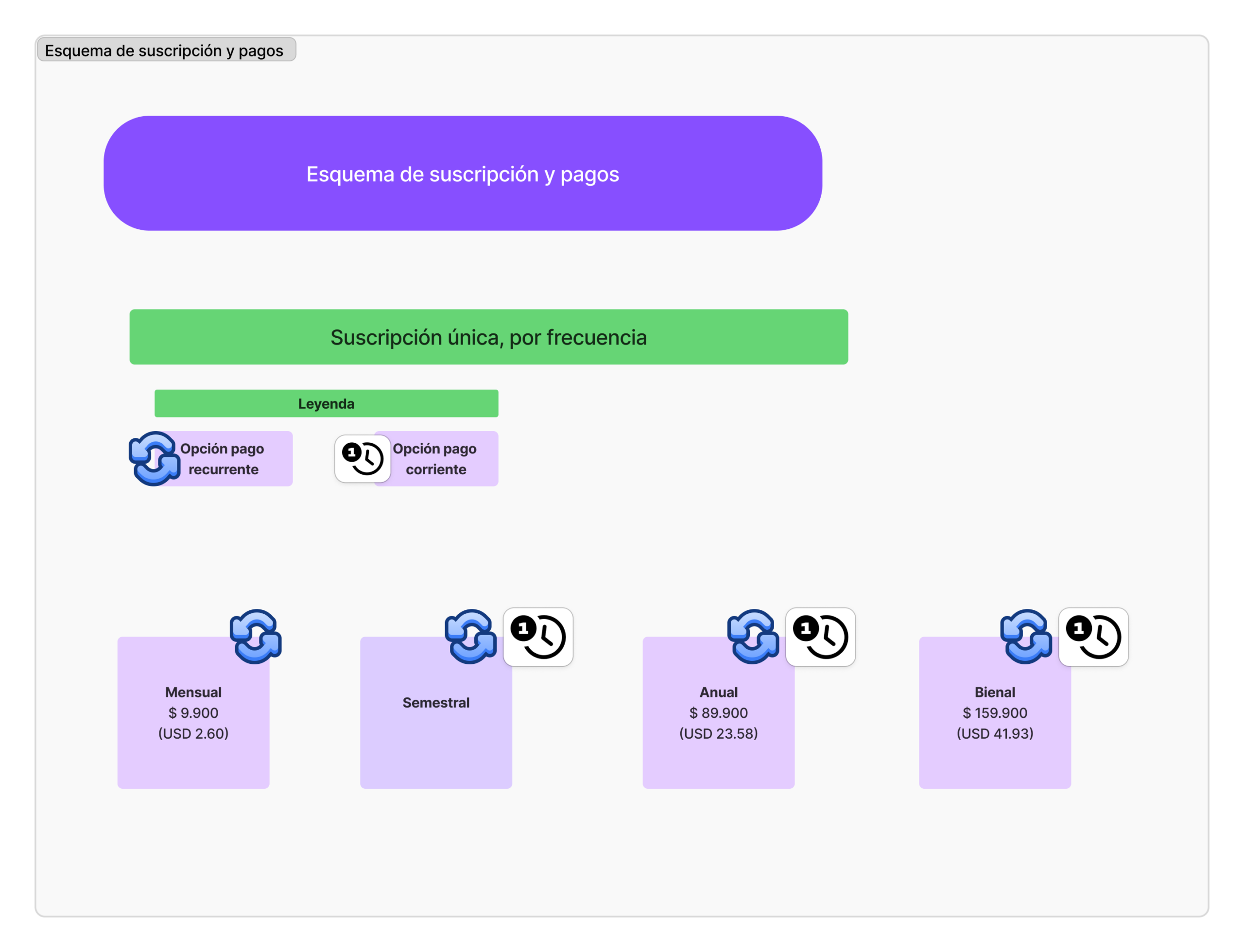
- Subscription and payments architecture
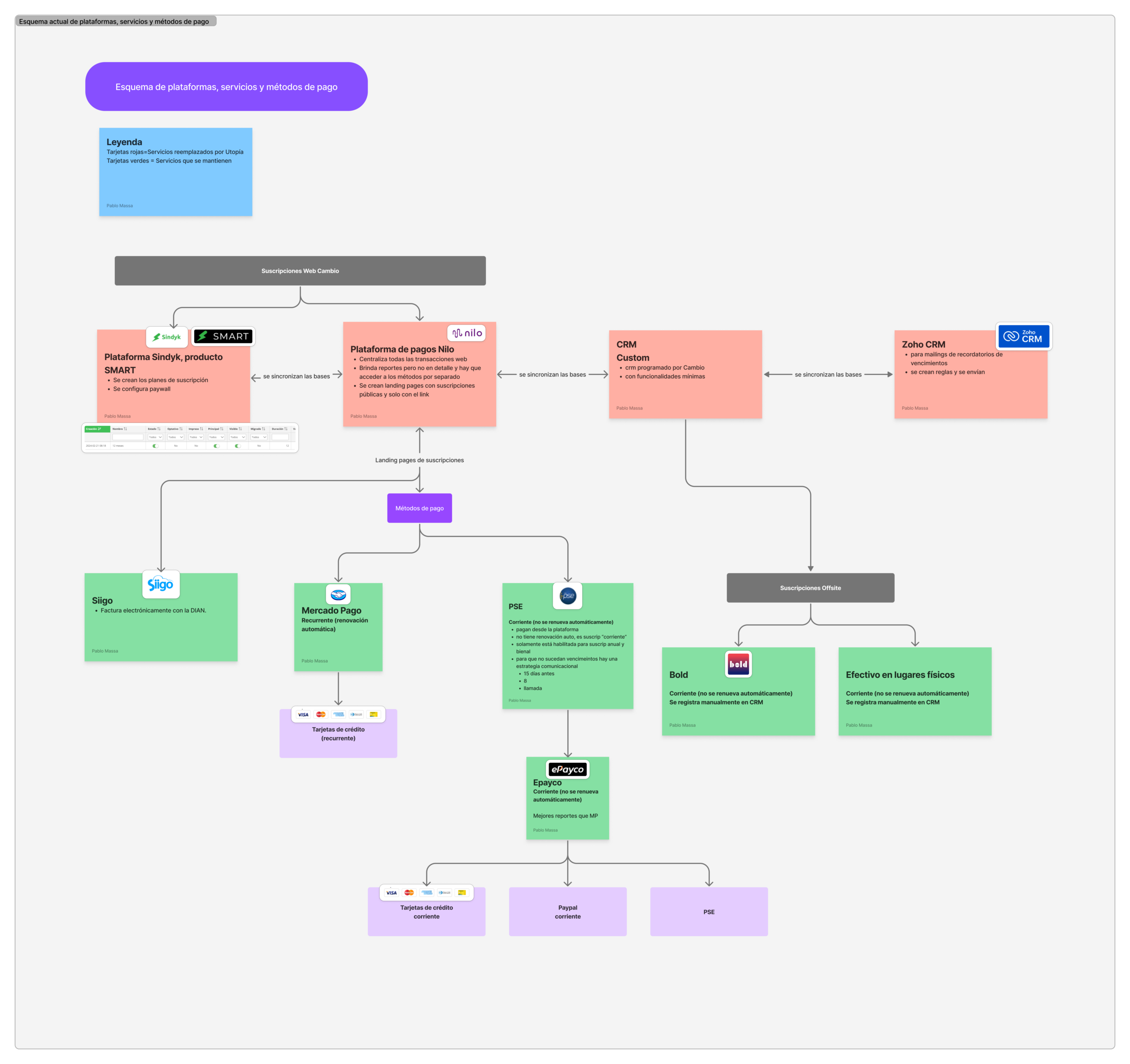
- Current platform ecosystem, including services, integrations, and payment providers
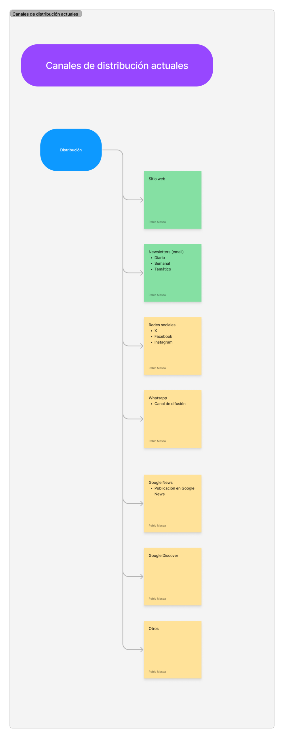
- Content distribution channels and traffic sources
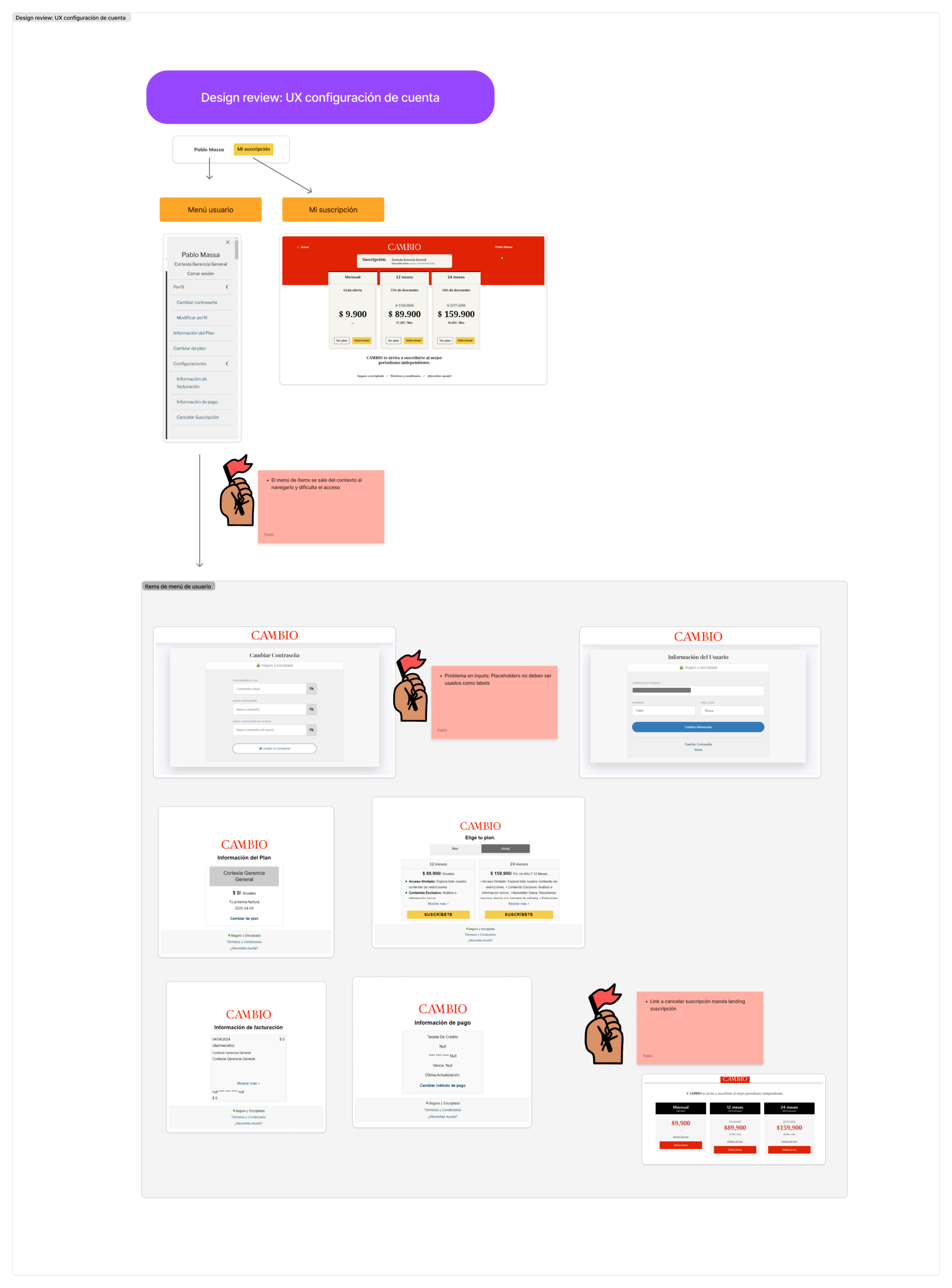
- UX issues in account configuration and user settings
- Friction points in the subscription journey
- Information architecture and visual design inconsistencies
Key findings
Dependency on multiple external platforms and services
The product relied on a fragmented ecosystem of third party tools for core functionality.
Subscription UX
Subscription flow and account management are fragmented and difficult to navigate
Payment provider fragmentation
Loosely integrated payment providers create a fragmented payment experience.
Performance
React based site is slow and not properly optimized.
Information architecture and visual design
Inconsistent UI patterns and weak hierarchy reduce clarity across the site.
SEO
Acceptable performance but with opportunities for improvement.
Competitive landscape
Competitors rely on ads and similar paywall models, with limited UX differentiation.
Distribution channels
Audience acquisition depends heavily on external platforms such as social media and Google.
Planning and strategy
I translated findings into a migration plan and a target product experience that reduced dependency on external services and clarified subscription conversion.
Core planning artifacts
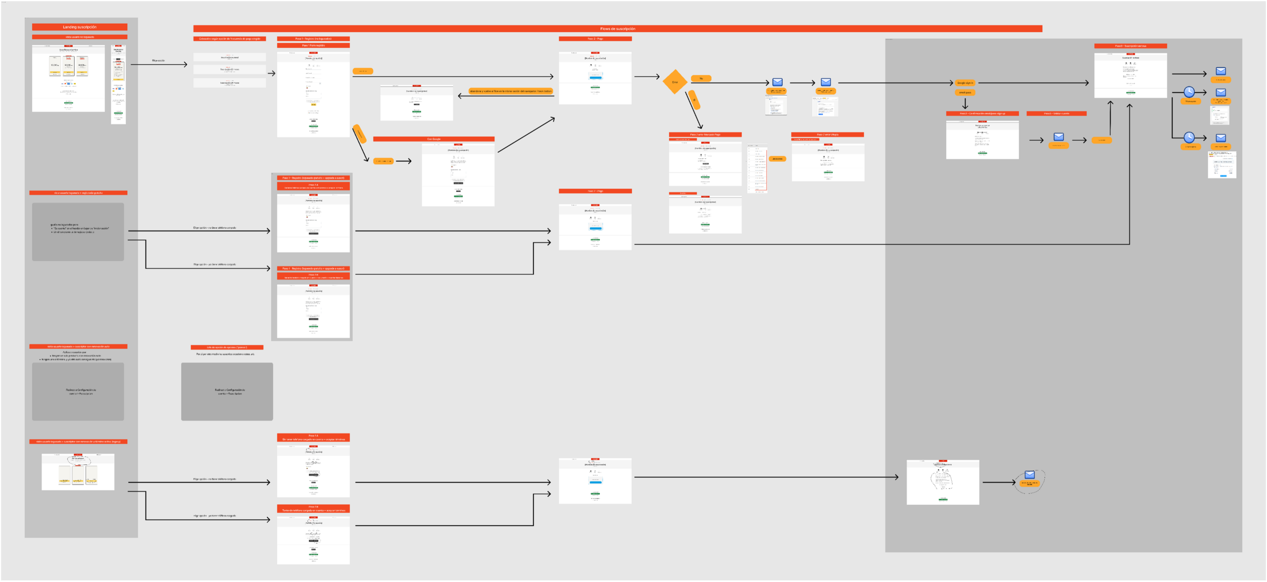
- Transition diagram for the platform migration
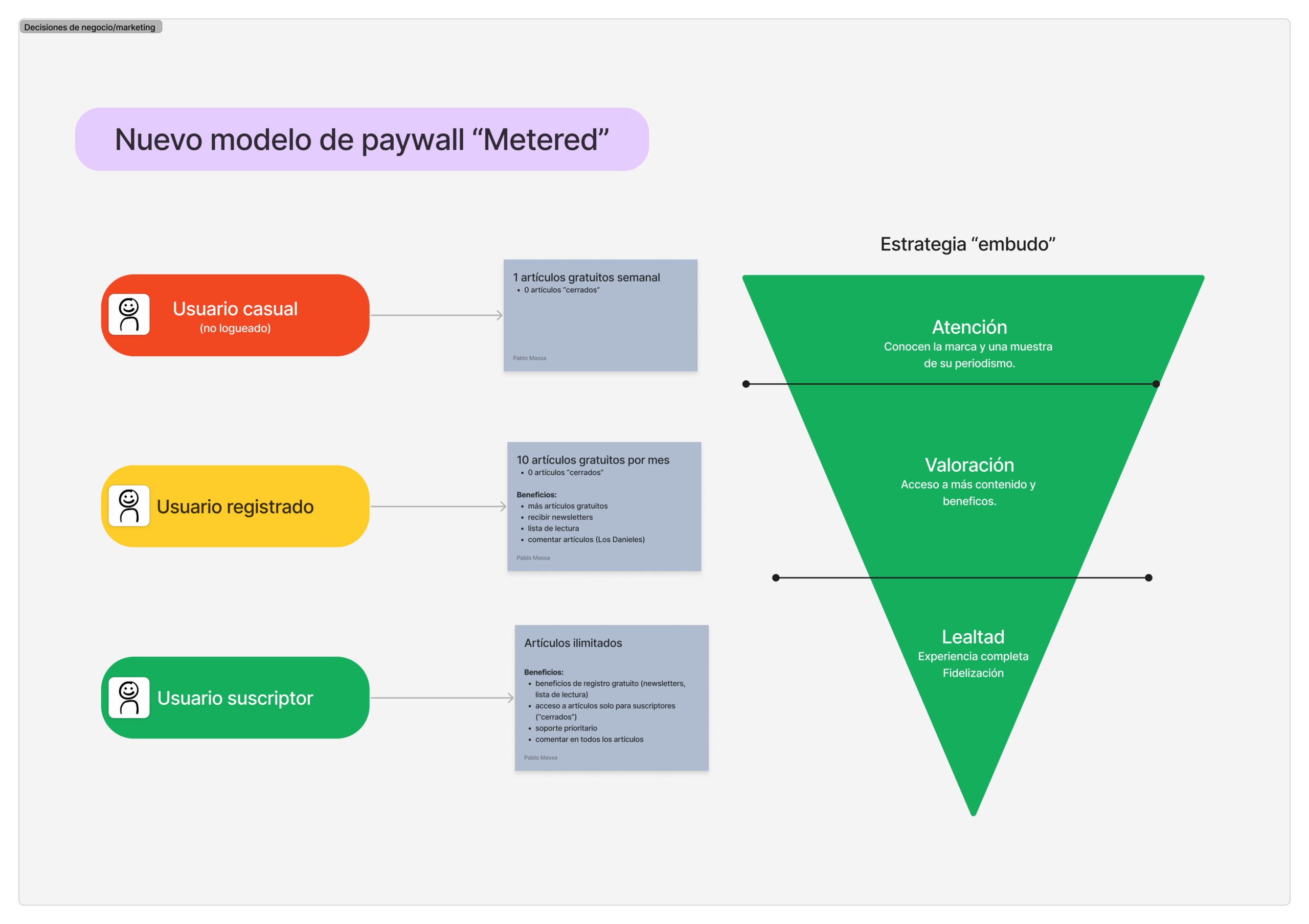
- Subscription strategy and paywall model
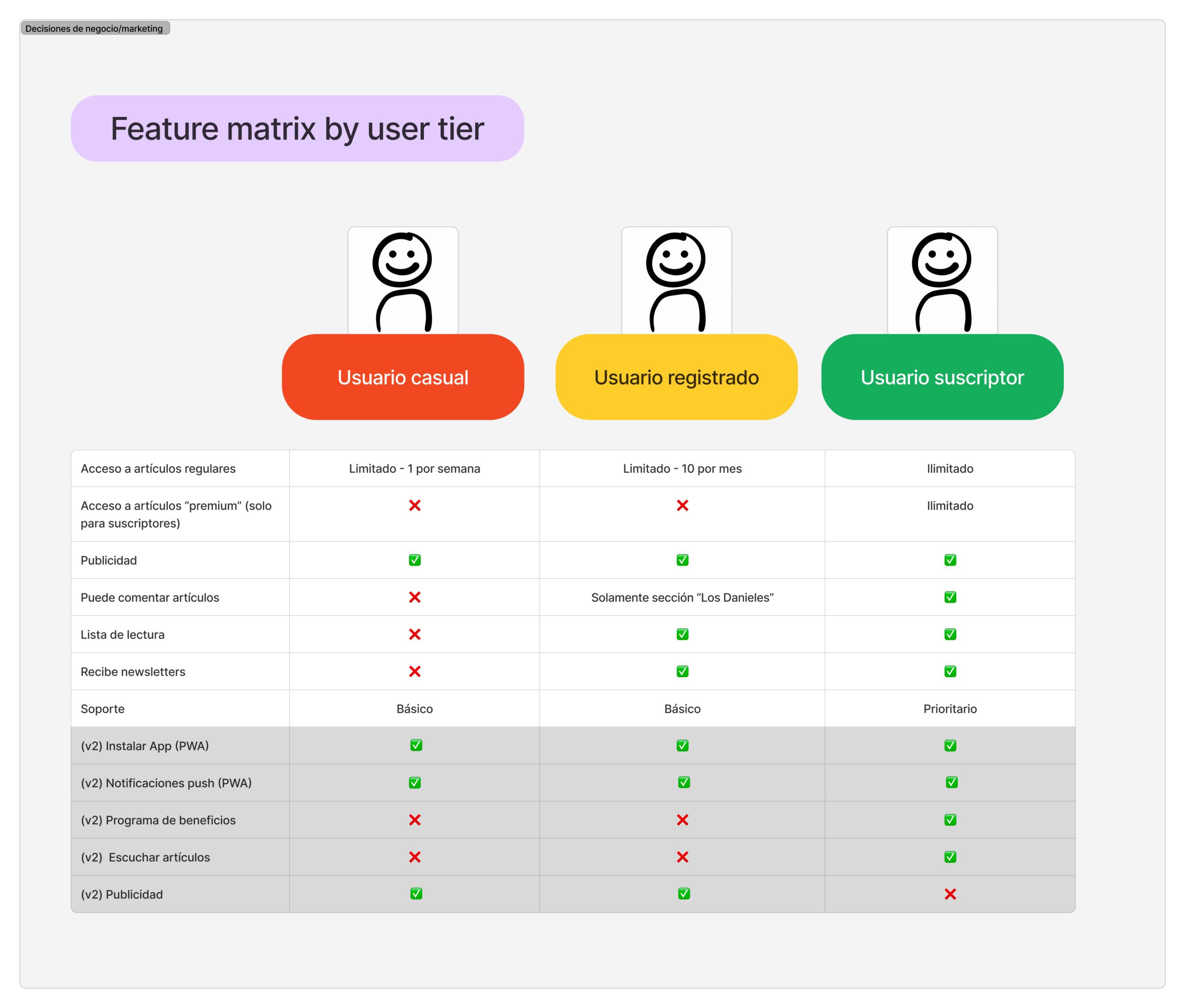
- Future end user product architecture (reader, registered user, subscriber)
- Product decisions and release scope
- Information architecture redesign, aligned with editorial
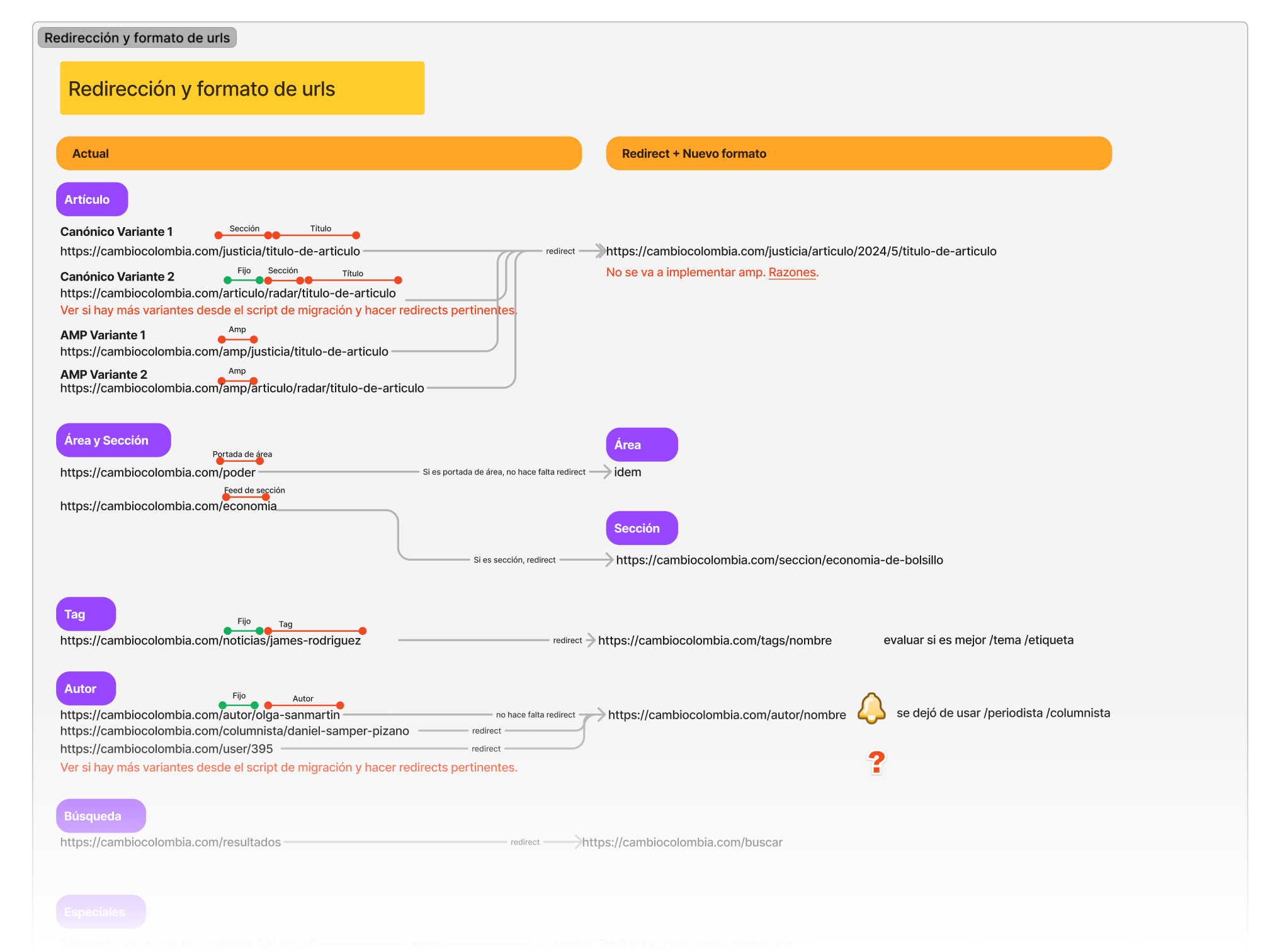
- URL format and redirects plan for SEO continuity
- New subscription flow definition
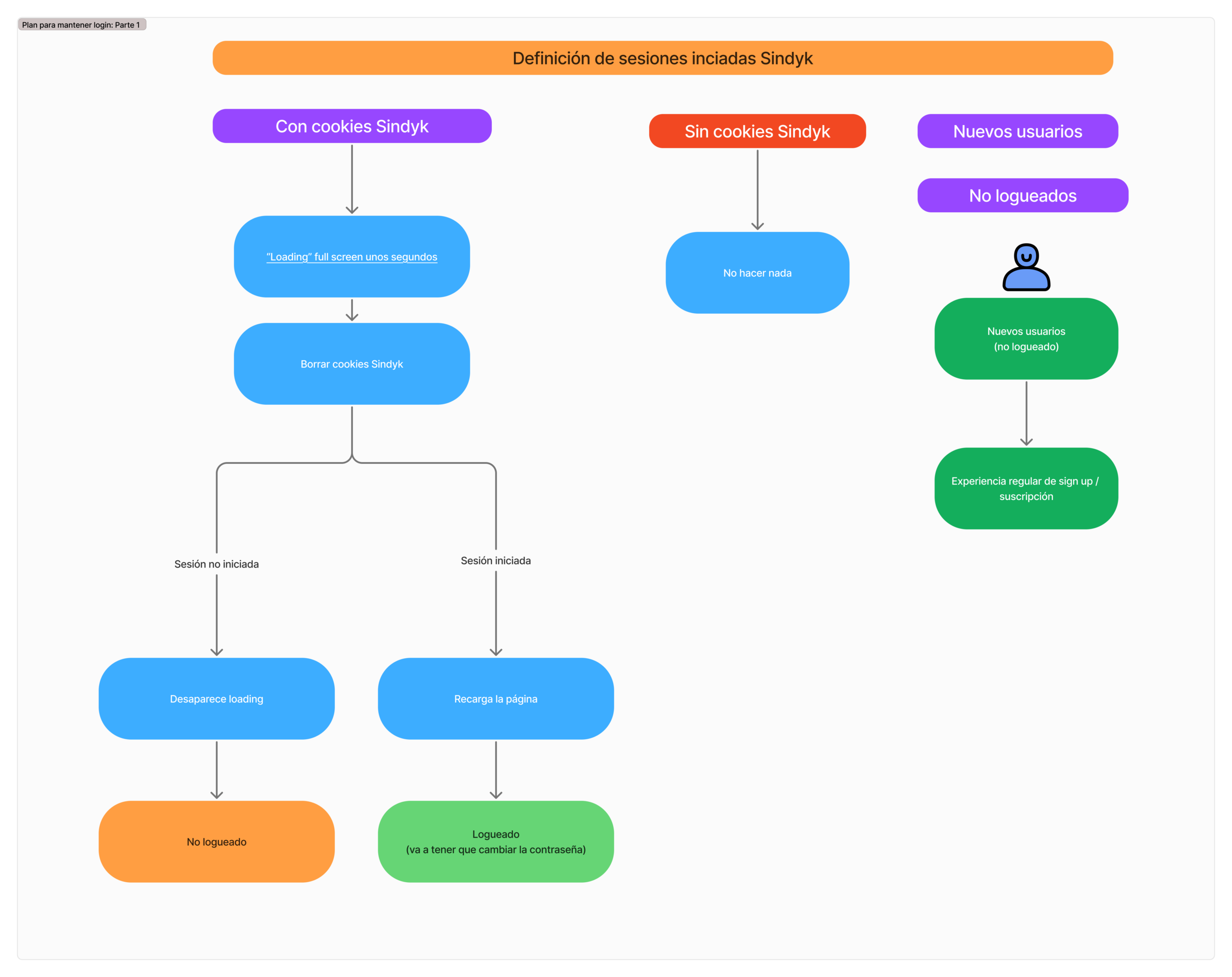
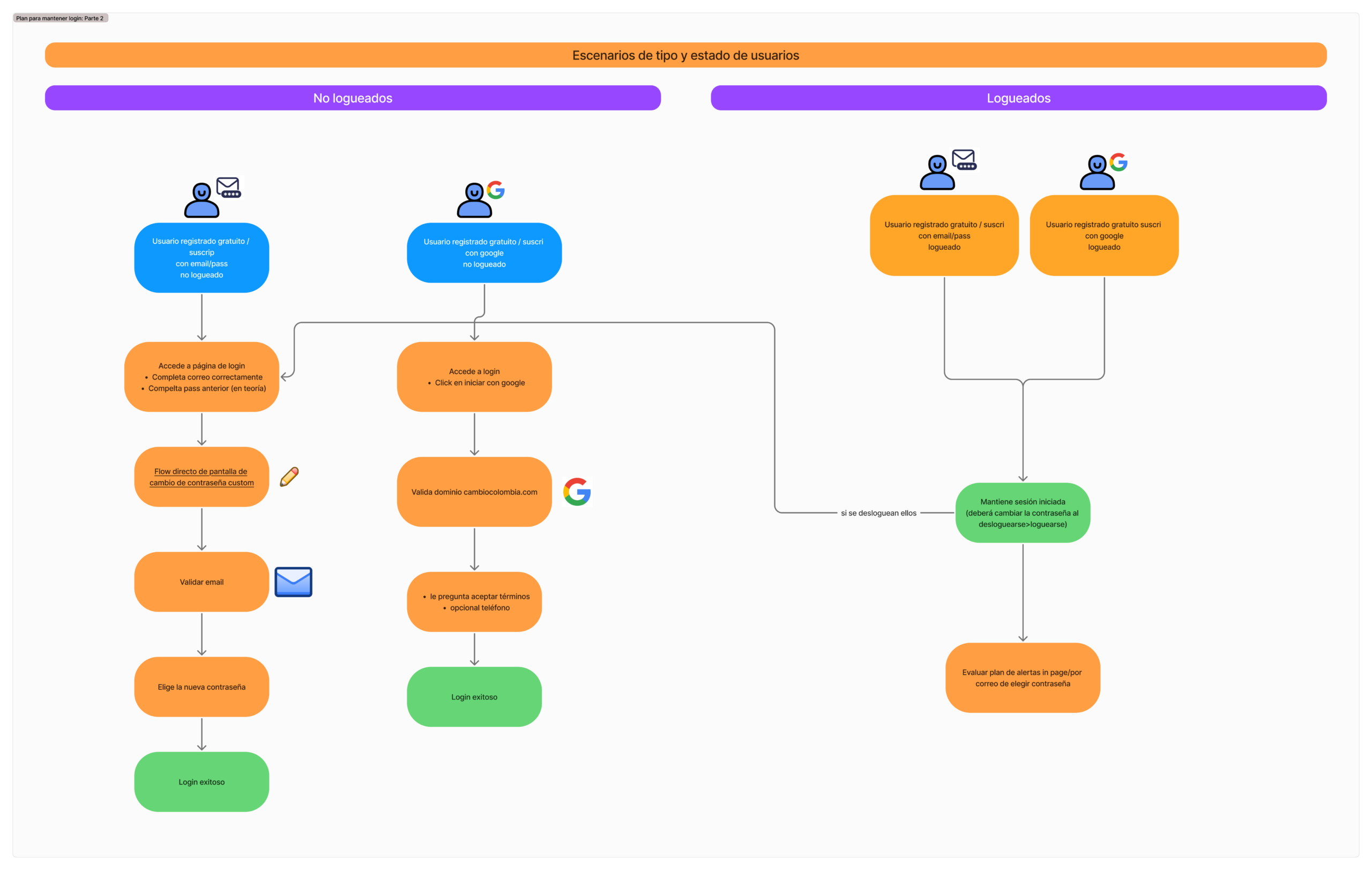
- Login continuity plan for platform change
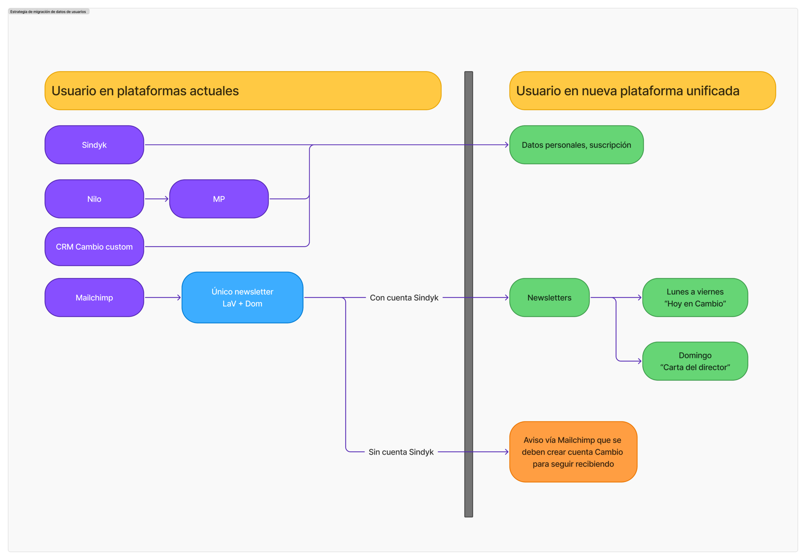
- User data migration strategy
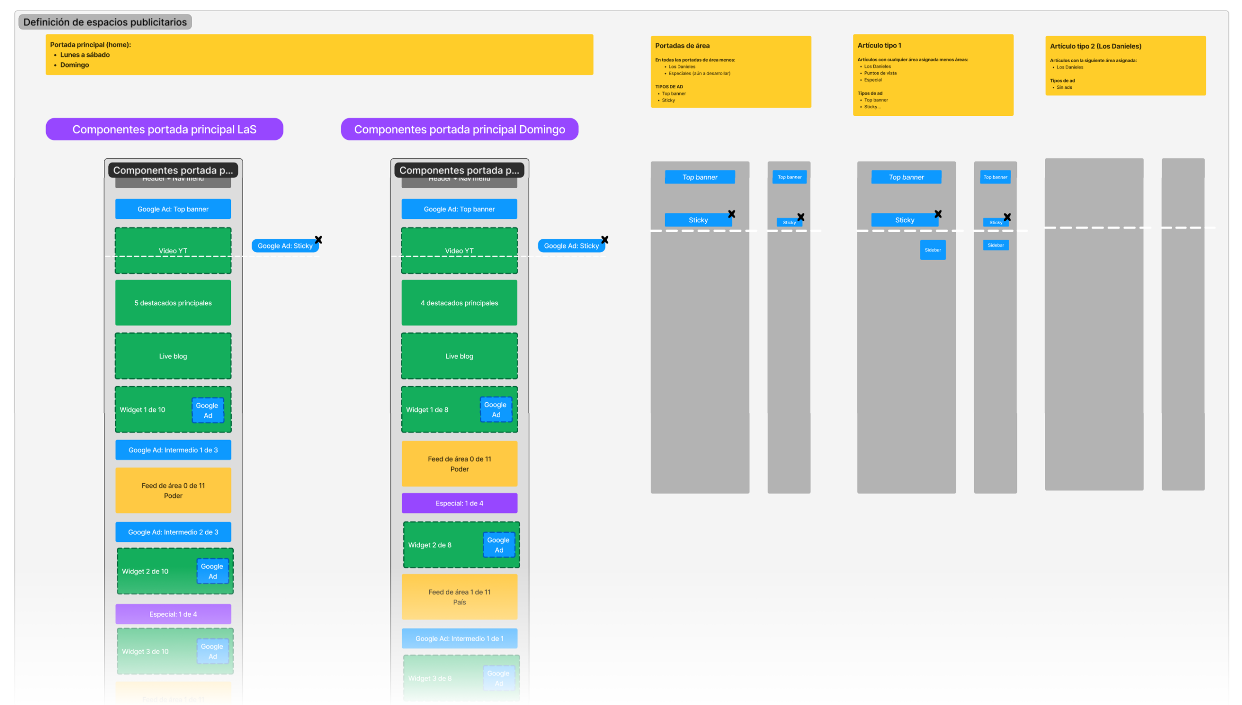
- Ad placement strategy
Constraints and risks
- Migration complexity: CMS and CRM consolidation affected publishing workflows, user accounts, and access rules
- Subscription dependency on payment provider changes and CRM data integrity
- SEO risk: URL changes and redirects required careful planning
- User continuity risk: maintaining login and session continuity during platform cutover
Transition diagram
Product feature mapping
Mapped and structured 29 user facing features to align product, UX, and business decisions. This exercise helped identify gaps, reduce redundancies, and define a clear path for product evolution.
Planning outcomes
Feature roadmap diagram
More planning artifacts
Solution
1) Platform consolidation
I defined how publishing and subscriber management would work within the new self-hosted platform, reducing reliance on services such as newsletter tooling, comments tooling, paywall tooling, and legacy CMS and CRM components.
What changed
- Centralized core product capabilities into the new platform
- Reduced integration surface area and operational overhead
- Clarified ownership of user data and subscription state across systems
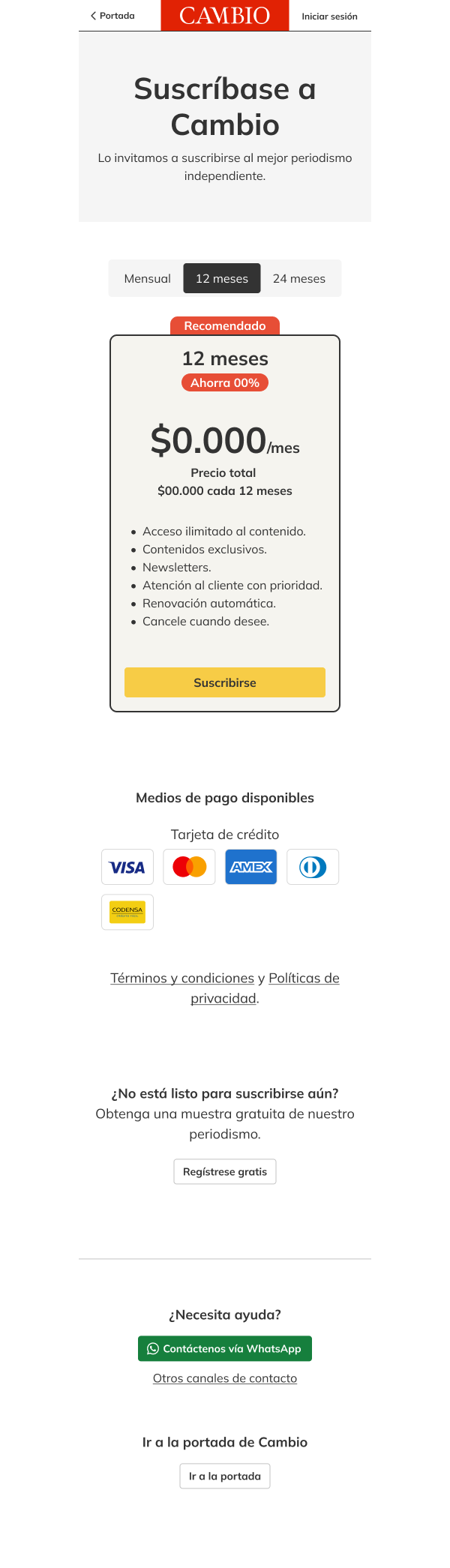
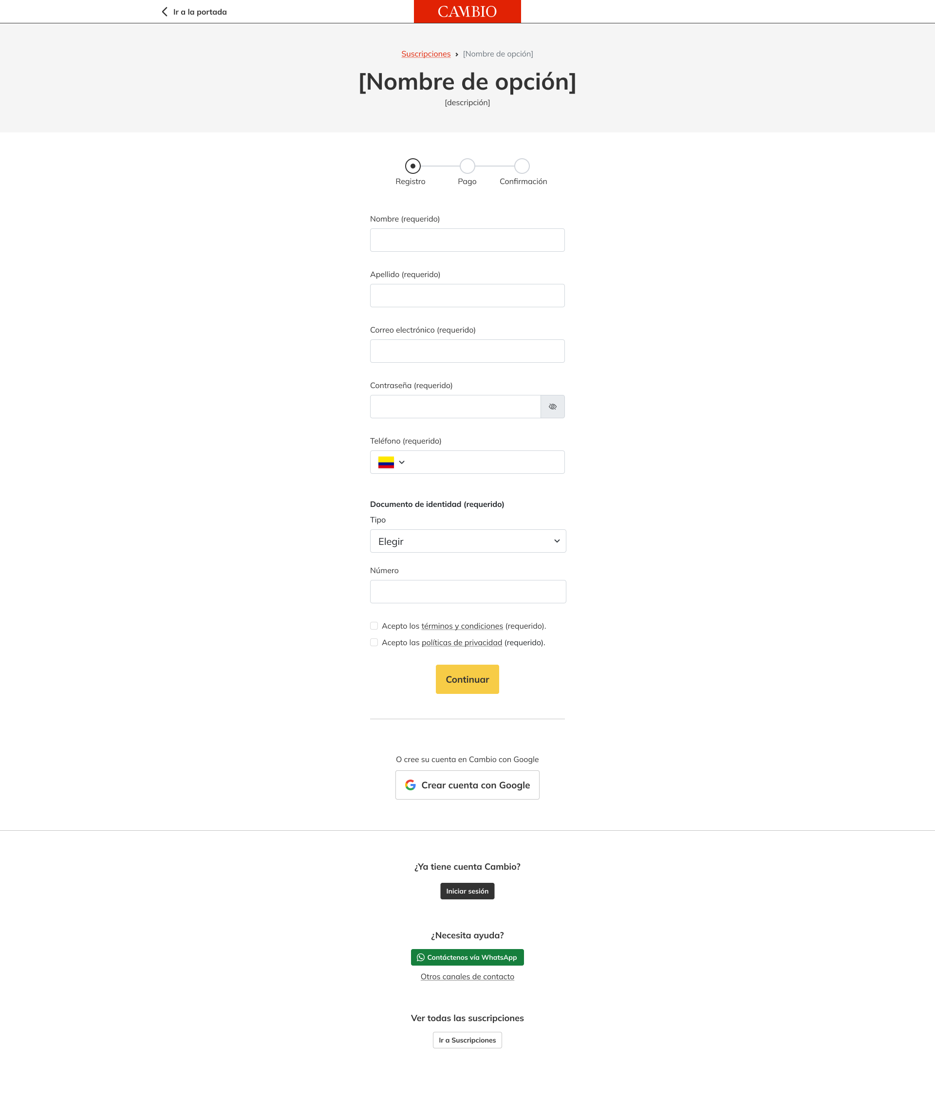
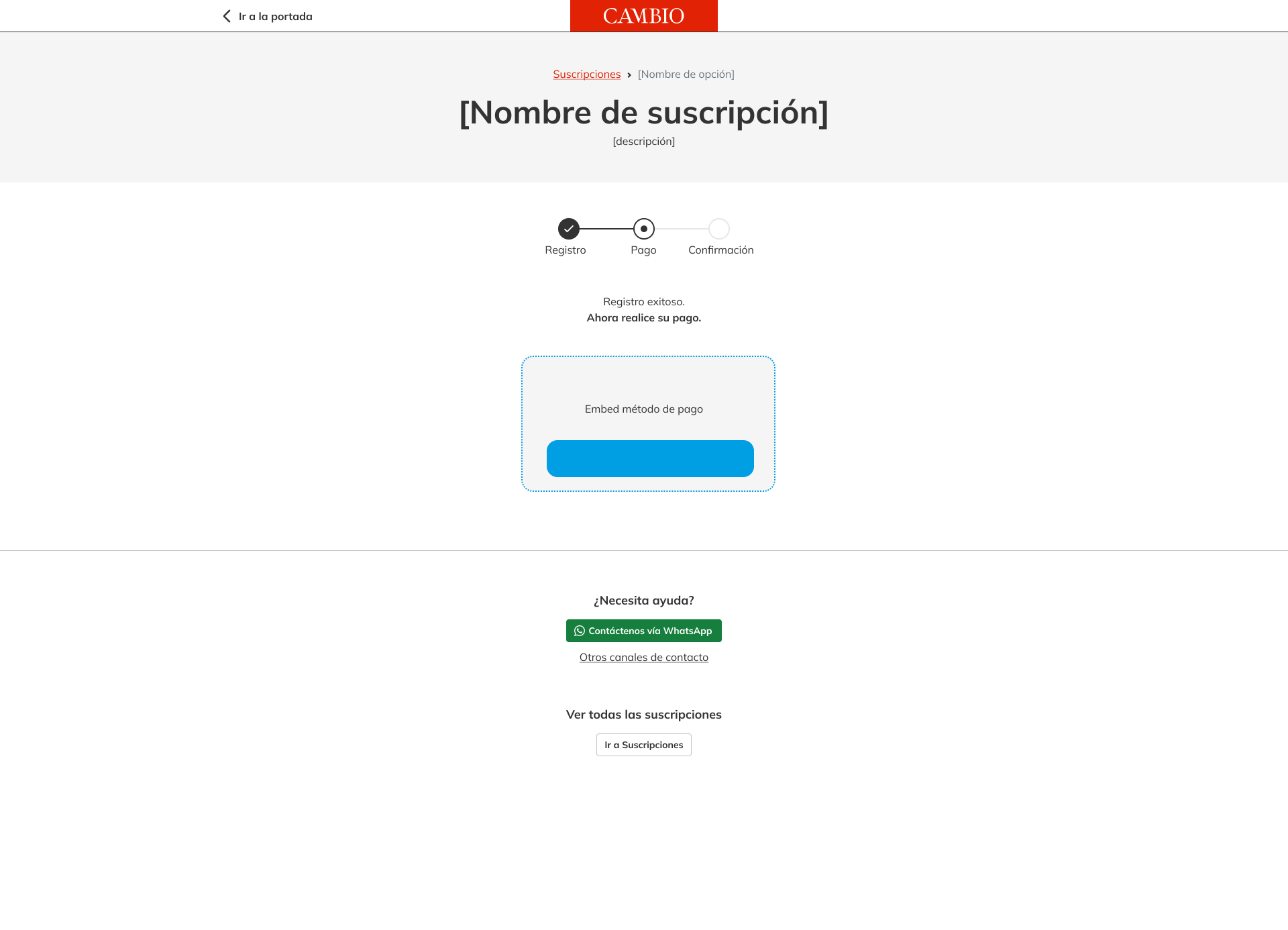
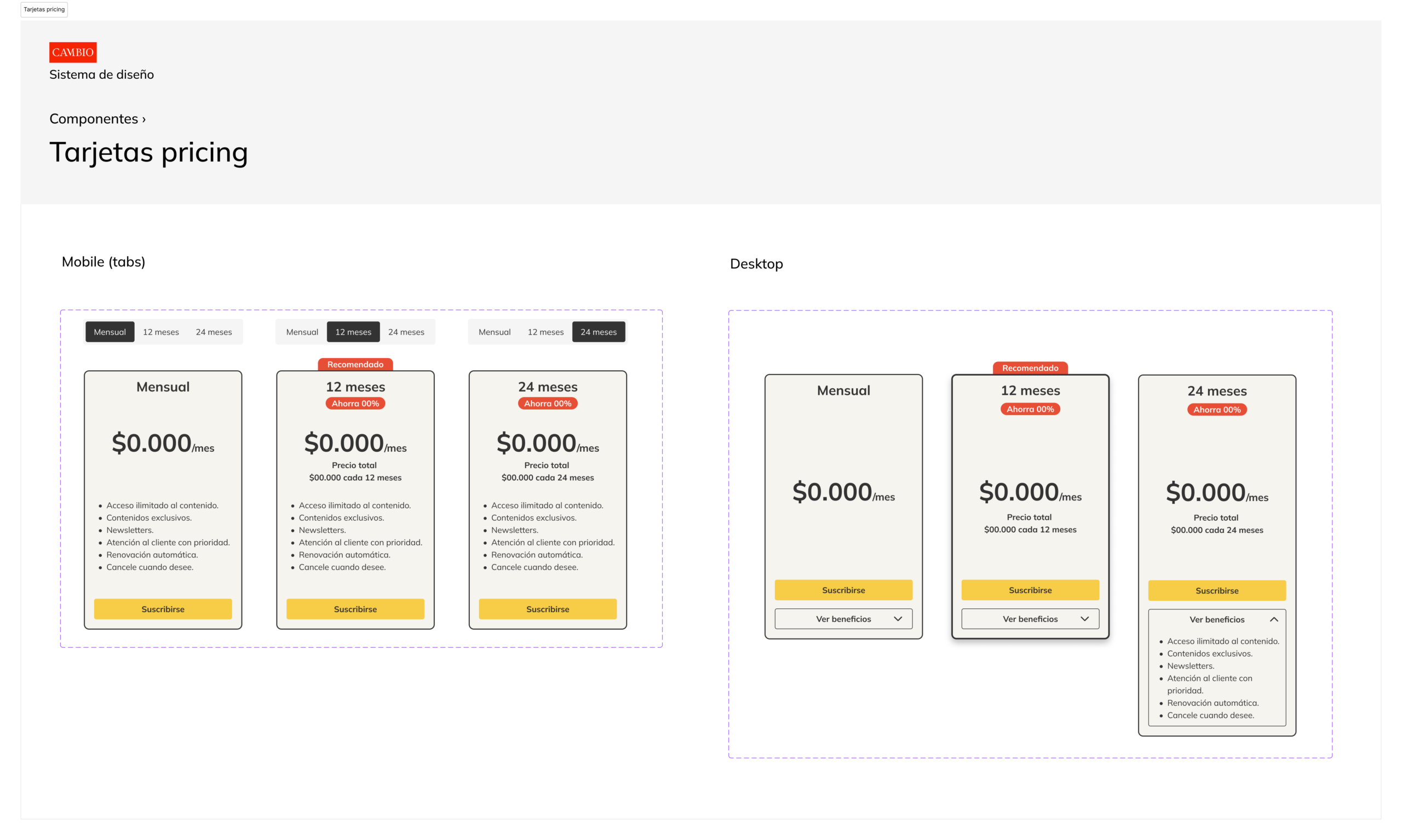
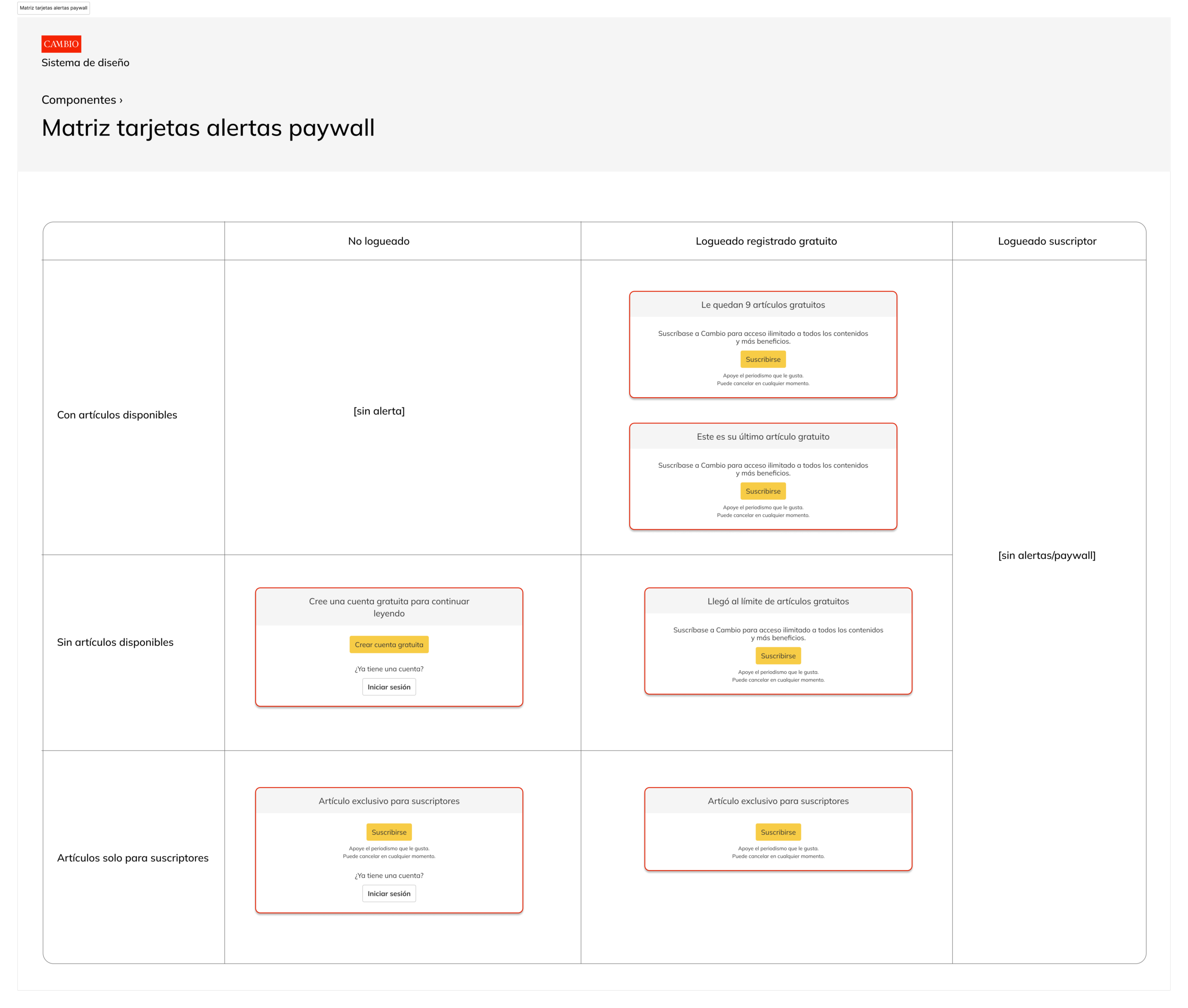
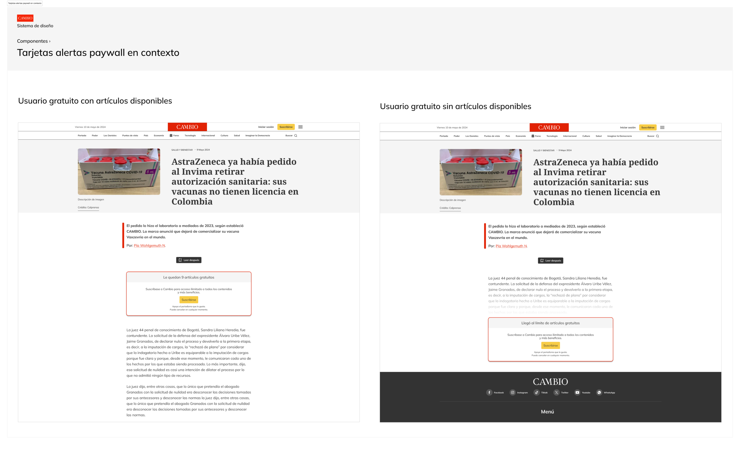
2) Subscription flow redesign
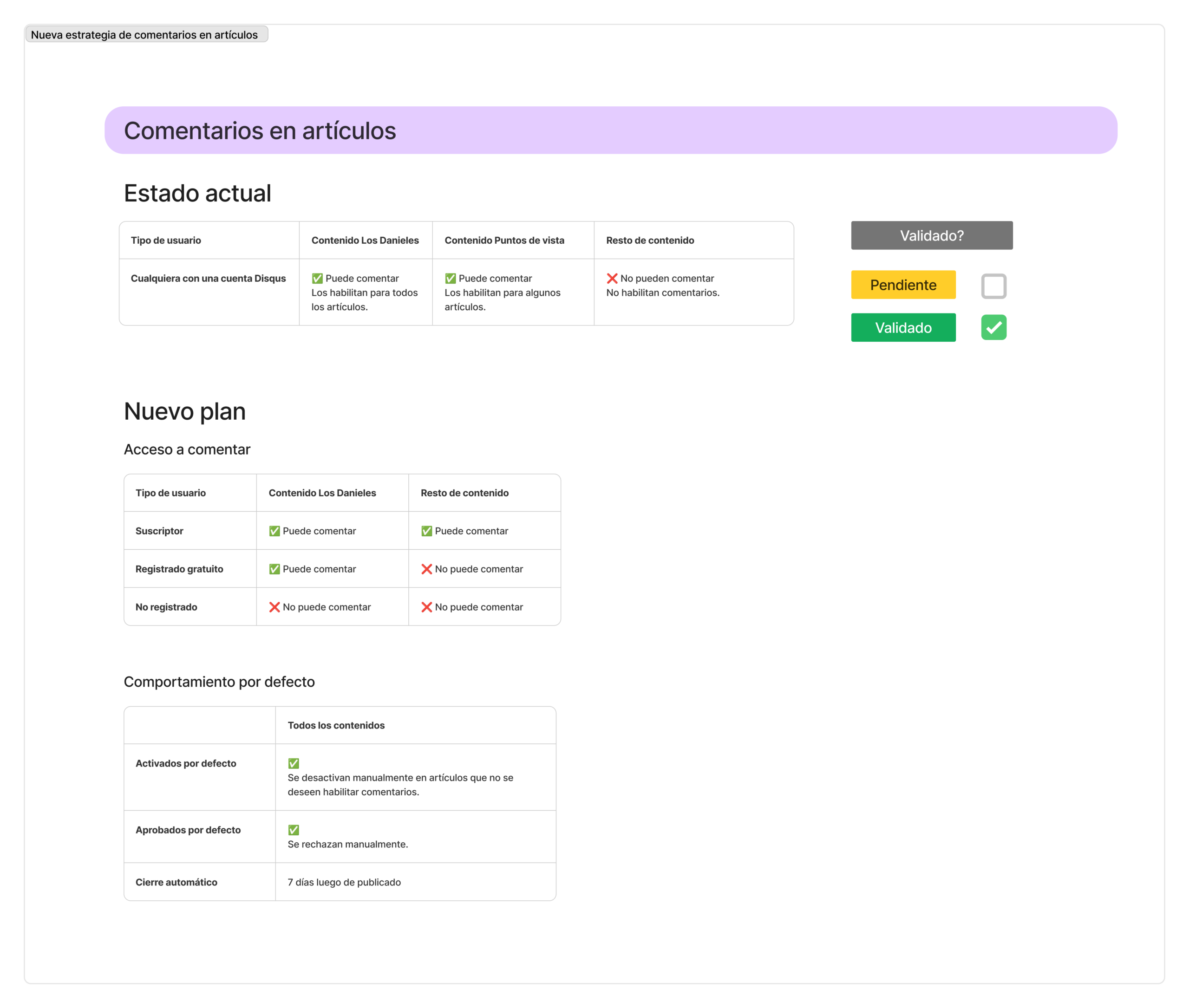
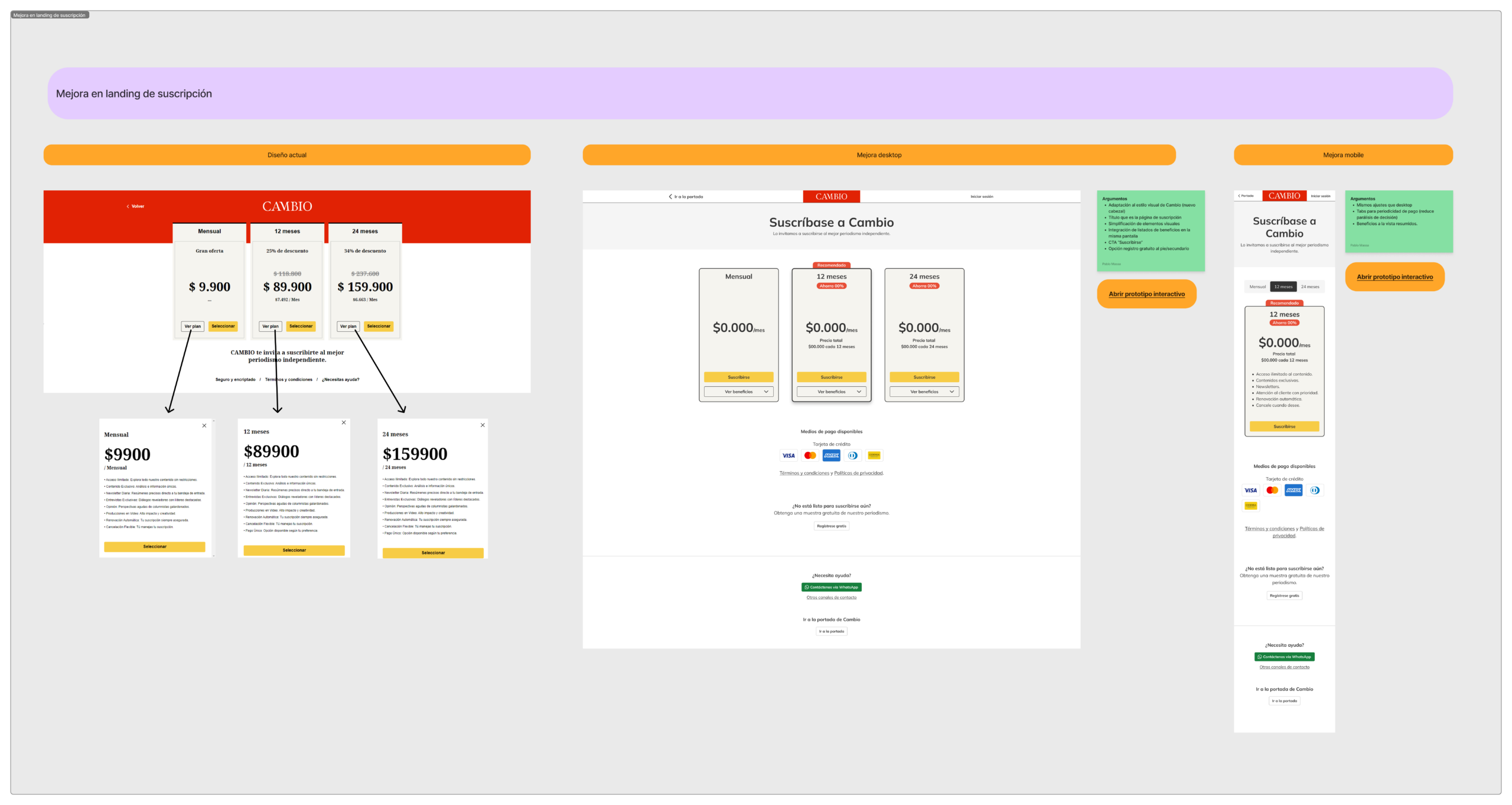
I redesigned the subscription journey to reduce friction and increase clarity across plan selection, account creation, payment, and confirmation.
What I designed
- End to end subscription flow and new UI
- Product and plan presentation rules
- Error states, retries, and CRM update scenarios
- Confirmation, access unlock, and account area behaviors
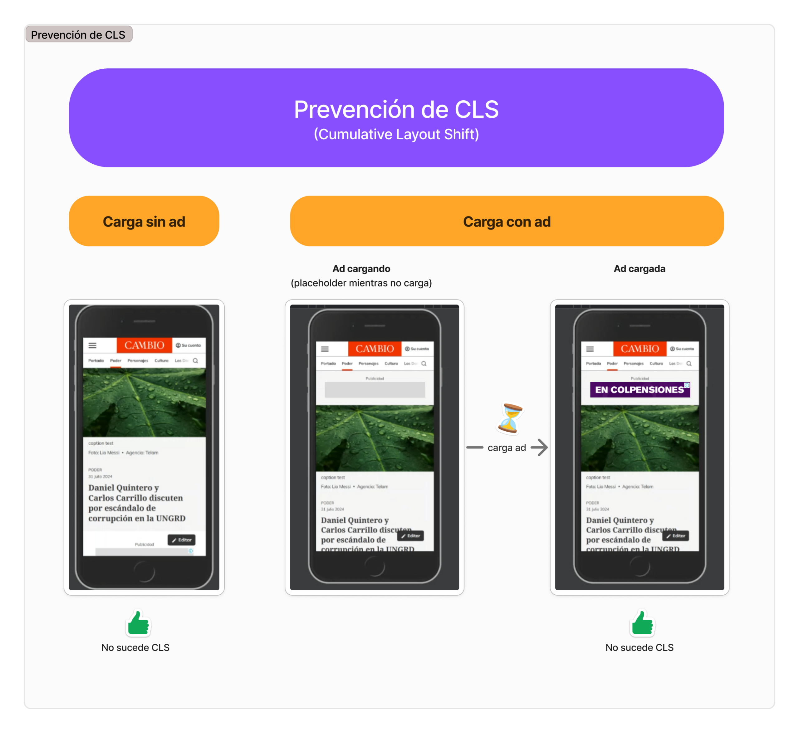
3) UI improvements across key screens
Alongside the migration, I improved core UI screens for consistency, readability, and navigation.
Areas improved
- Subscription and account management experiences
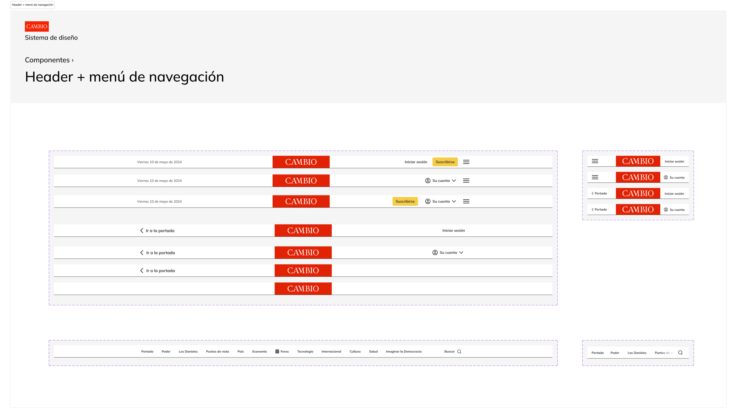
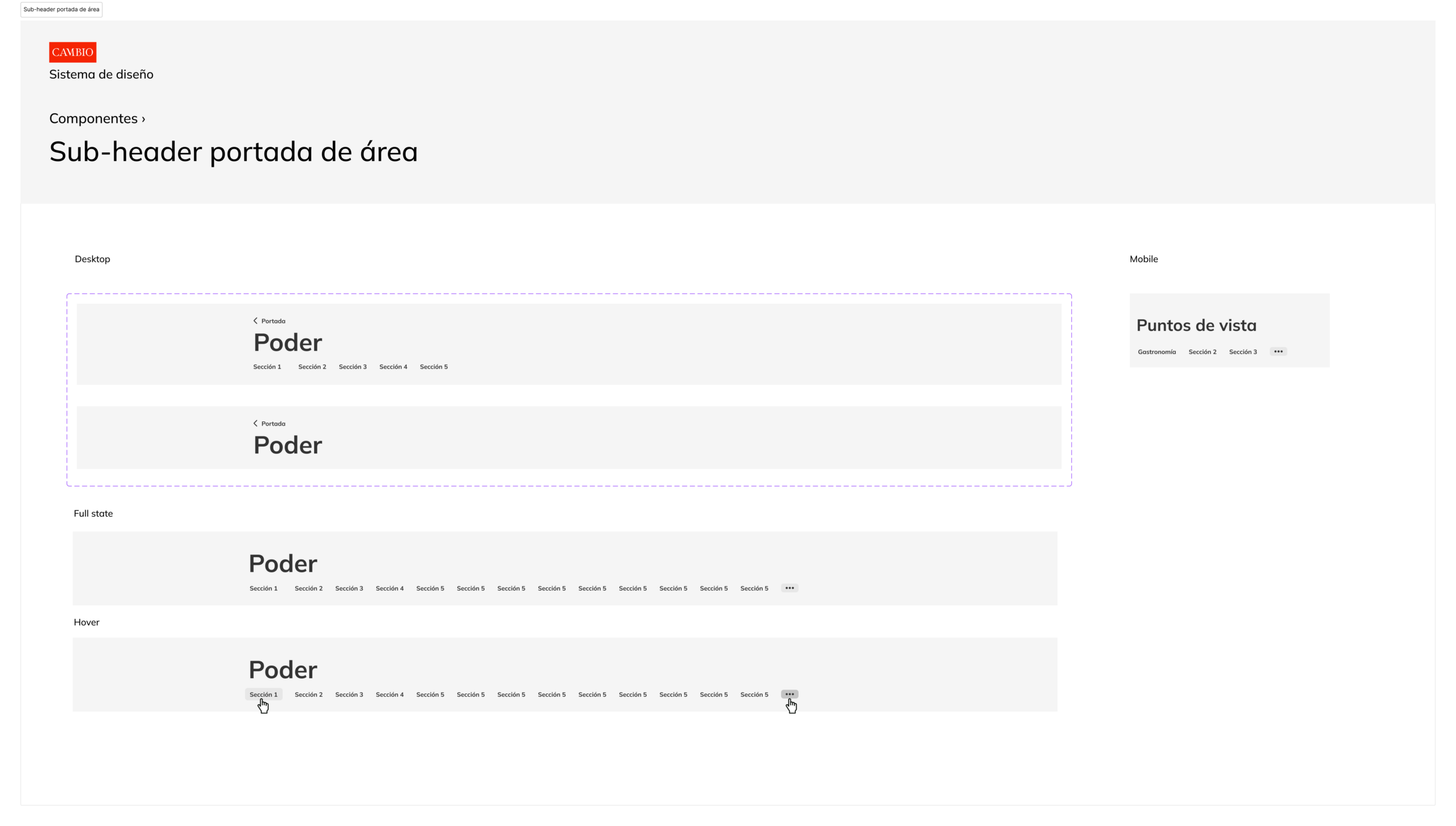
- Header, footer and navigation menu
- Article and newsletters layout and readability
- Advertising placements
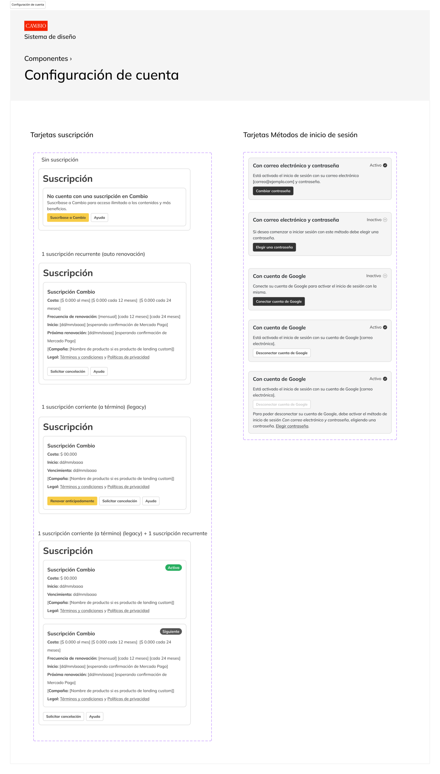
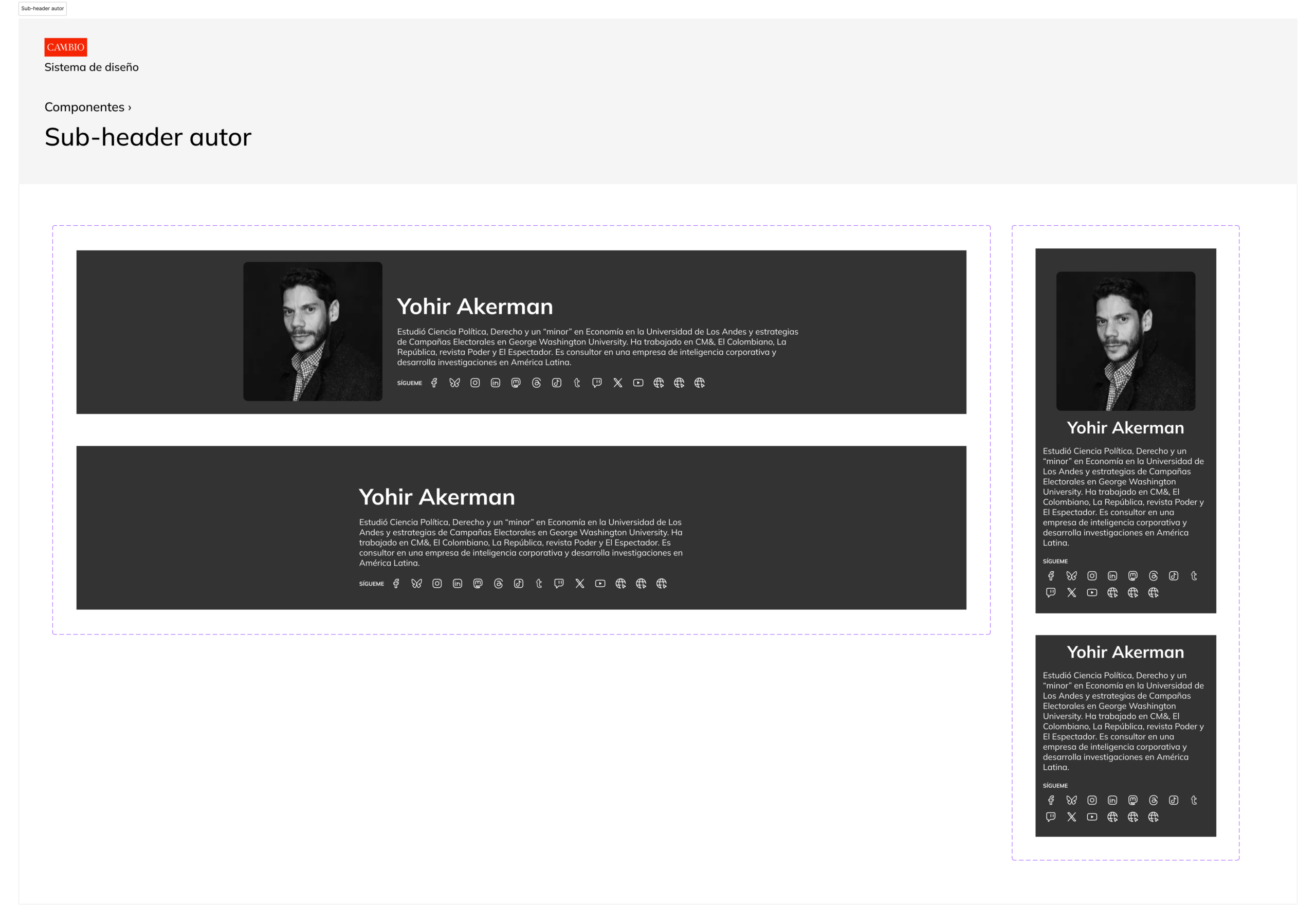
Subscription experience
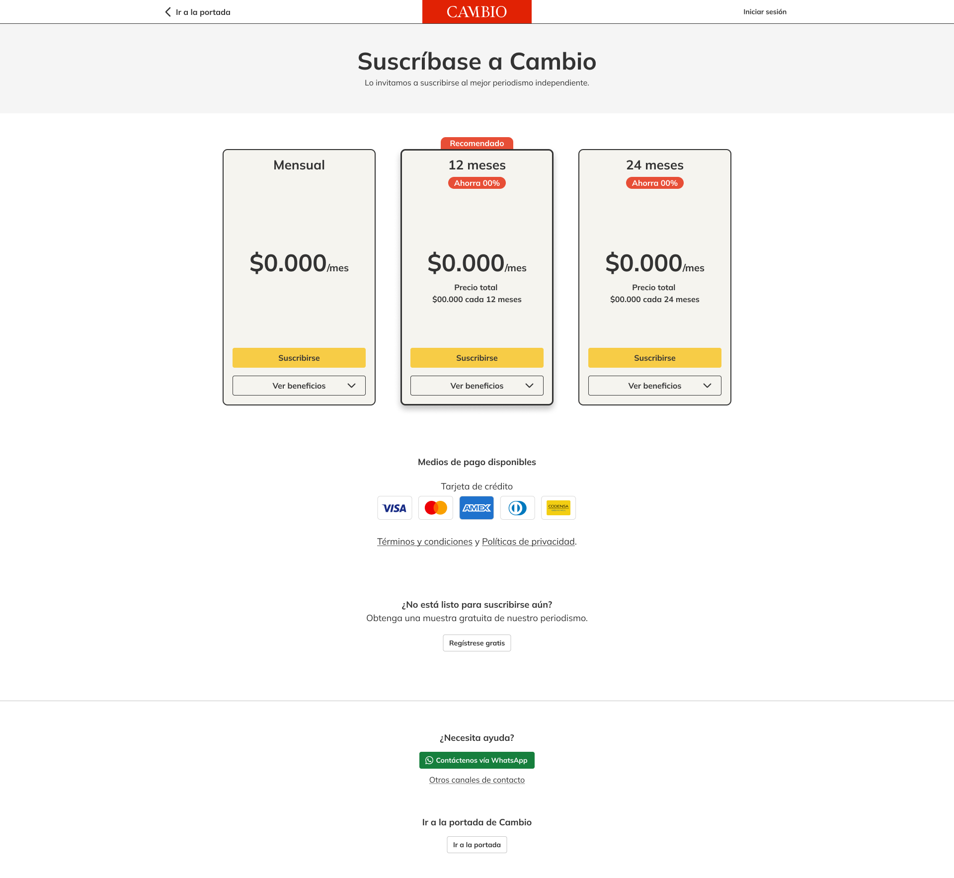
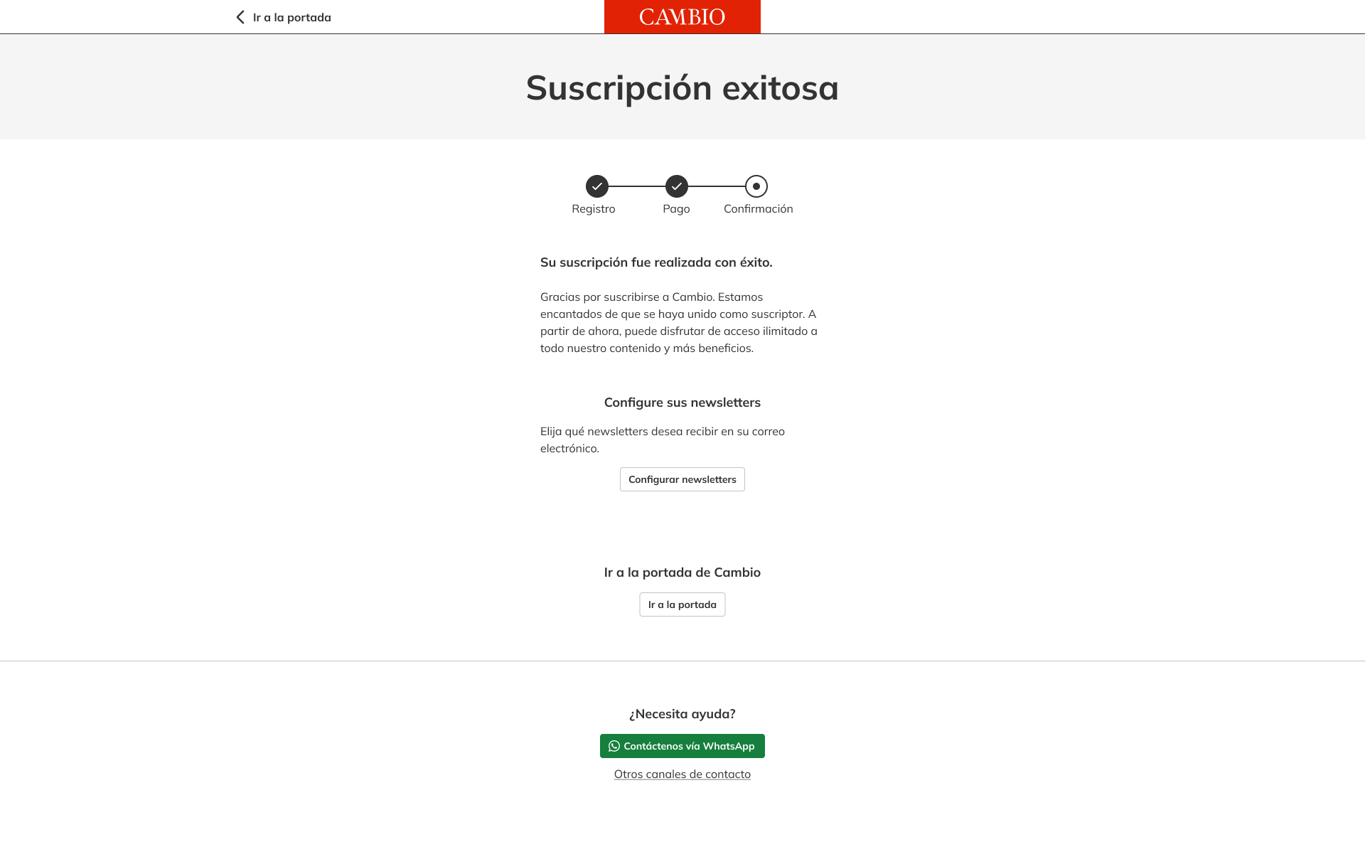
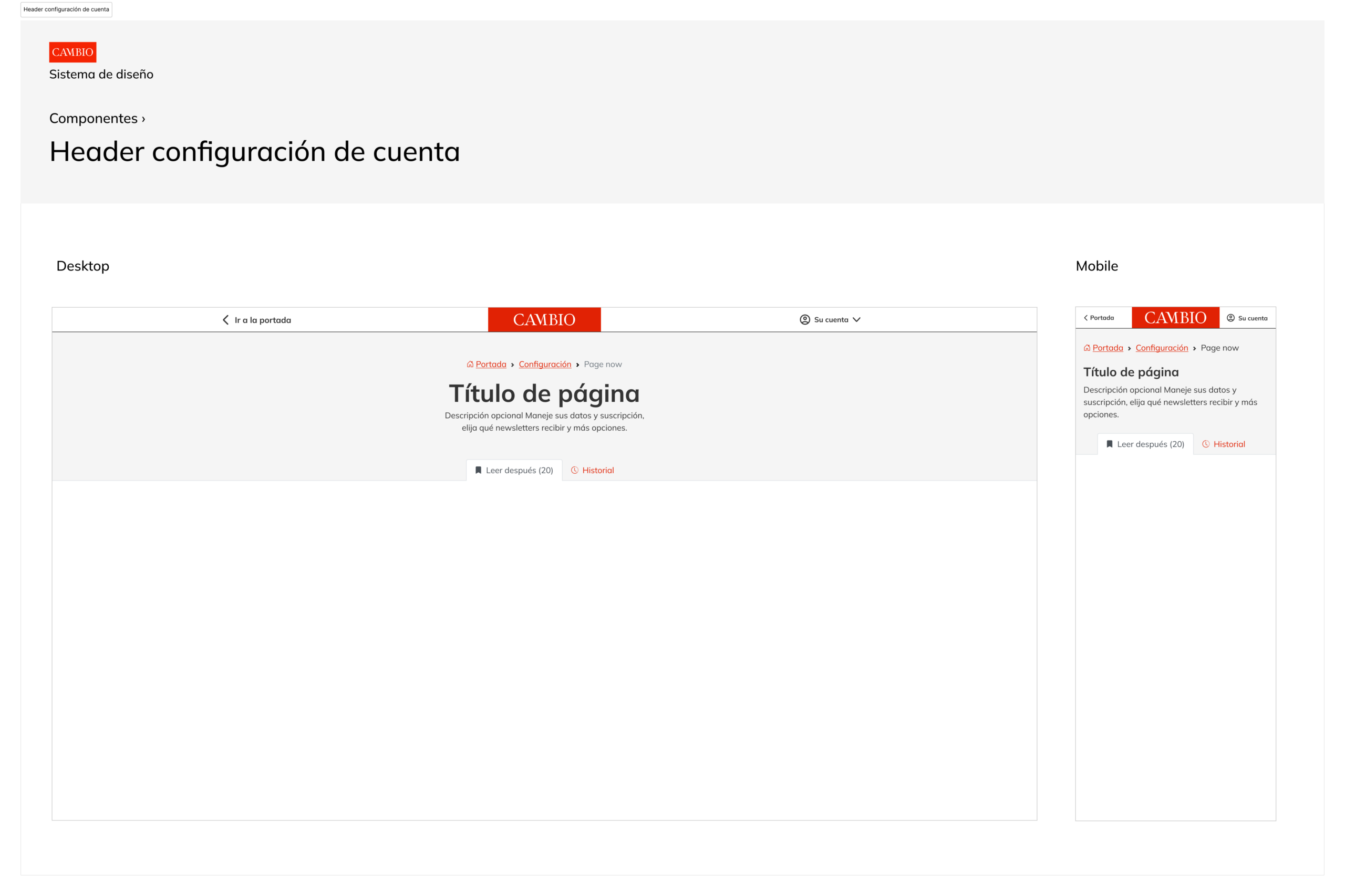
Account page
All account and subscription information was centralized into a single page to improve clarity and usability. New features and sections were added, information was reorganized, and copy was refined.
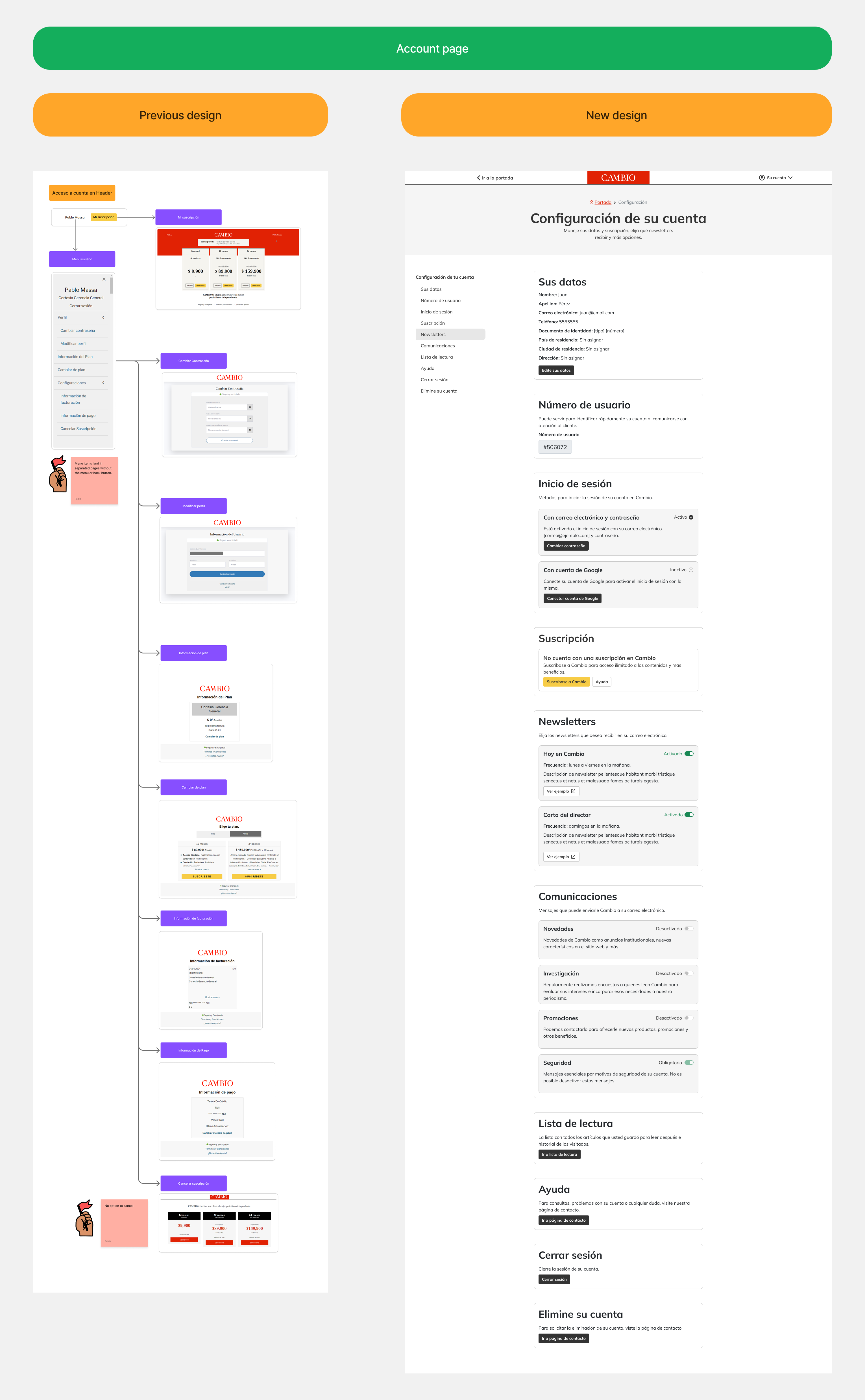
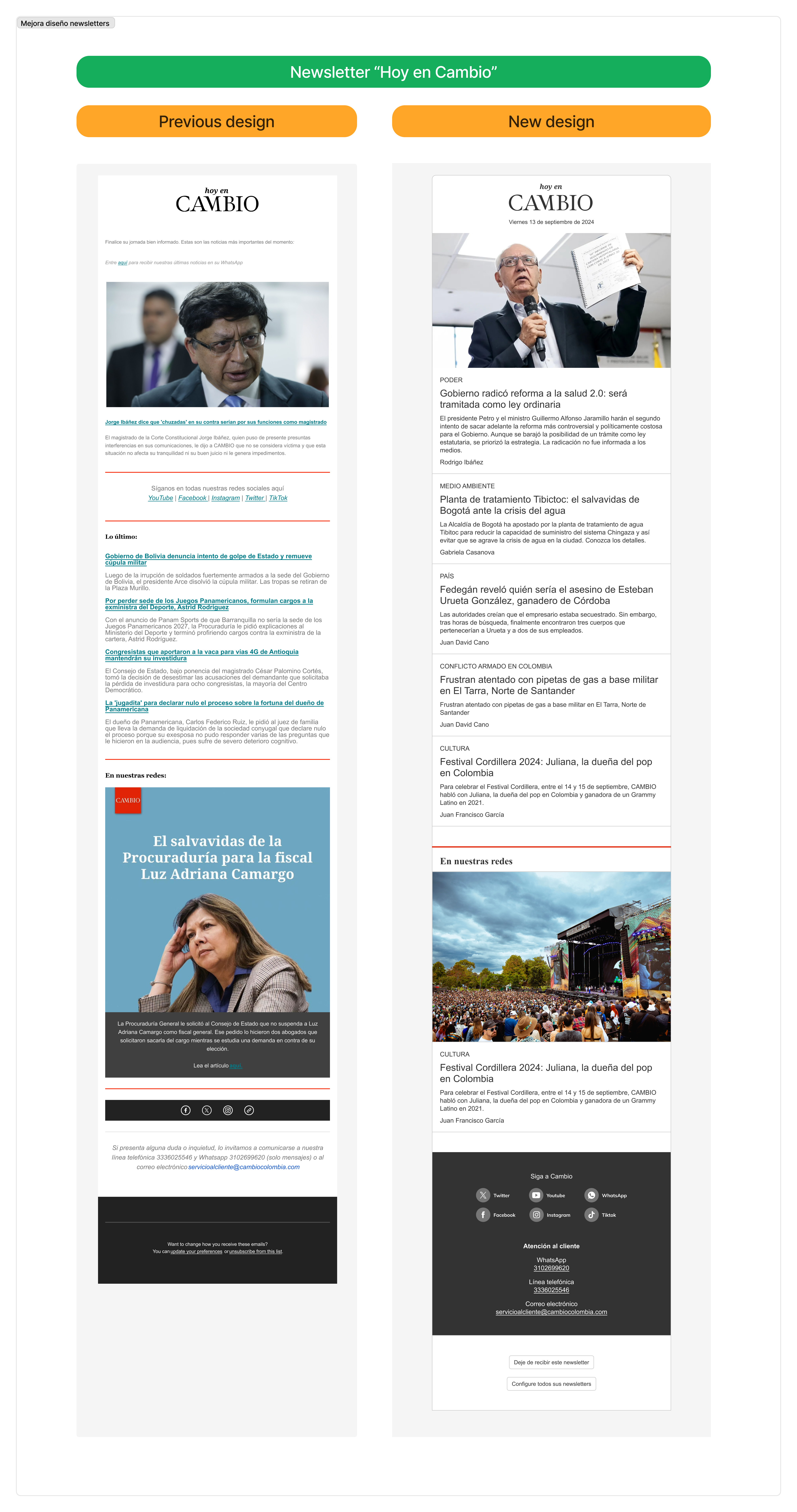
Newsletters
Visual design: The layout was redesigned to better align with the brand, improving readability, structure, and overall visual consistency.
Sending workflow: The process was simplified by integrating newsletters into the CMS. Instead of manually composing and sending them in Mailchimp, editors only need to select the articles and the system generates and sends the newsletter automatically.
Footer and full screen menu
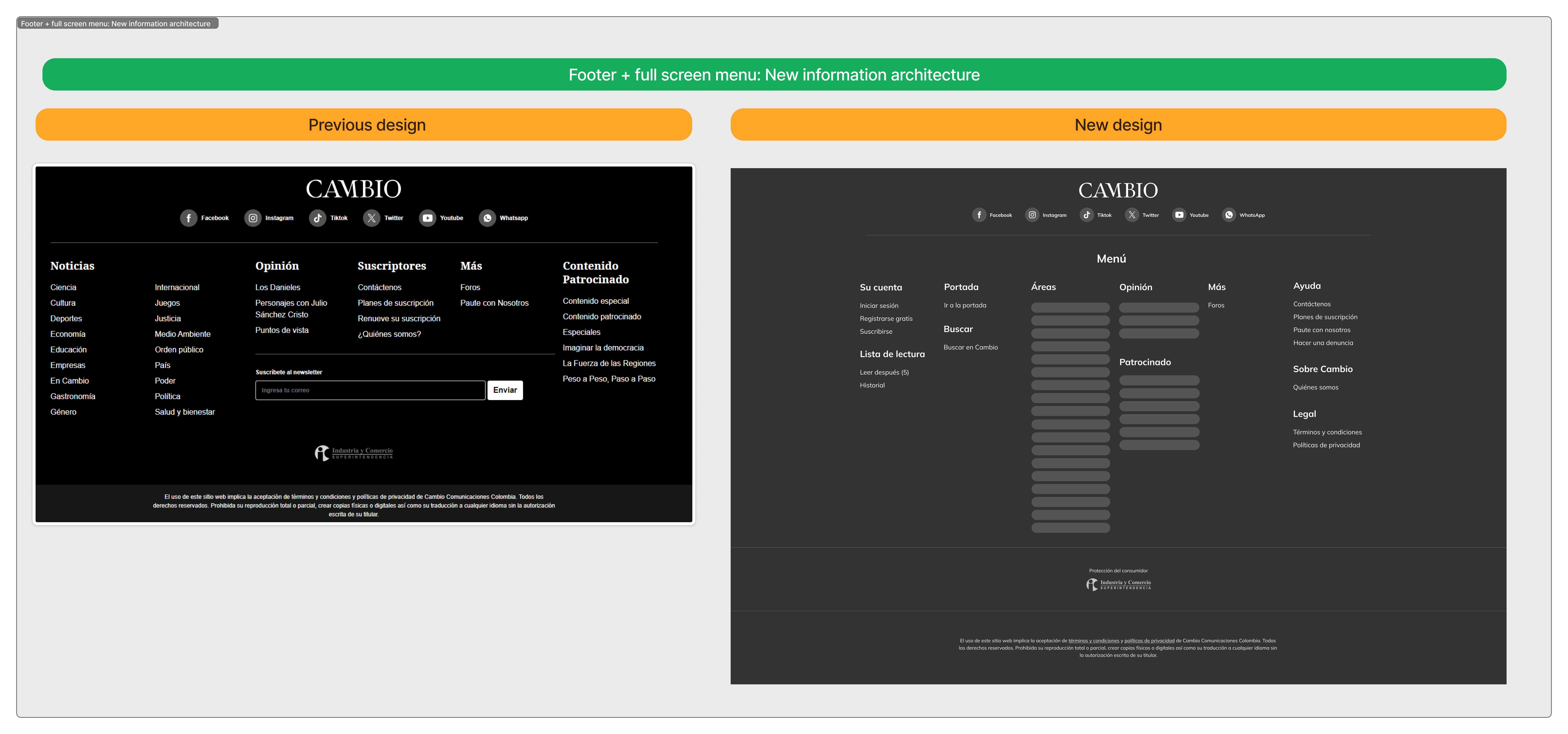
The footer and full screen navigation menu were redesigned to reflect the new information architecture. Content sections were reorganized, redundant links removed, and account, navigation, and support areas clarified to improve discoverability and overall navigation.
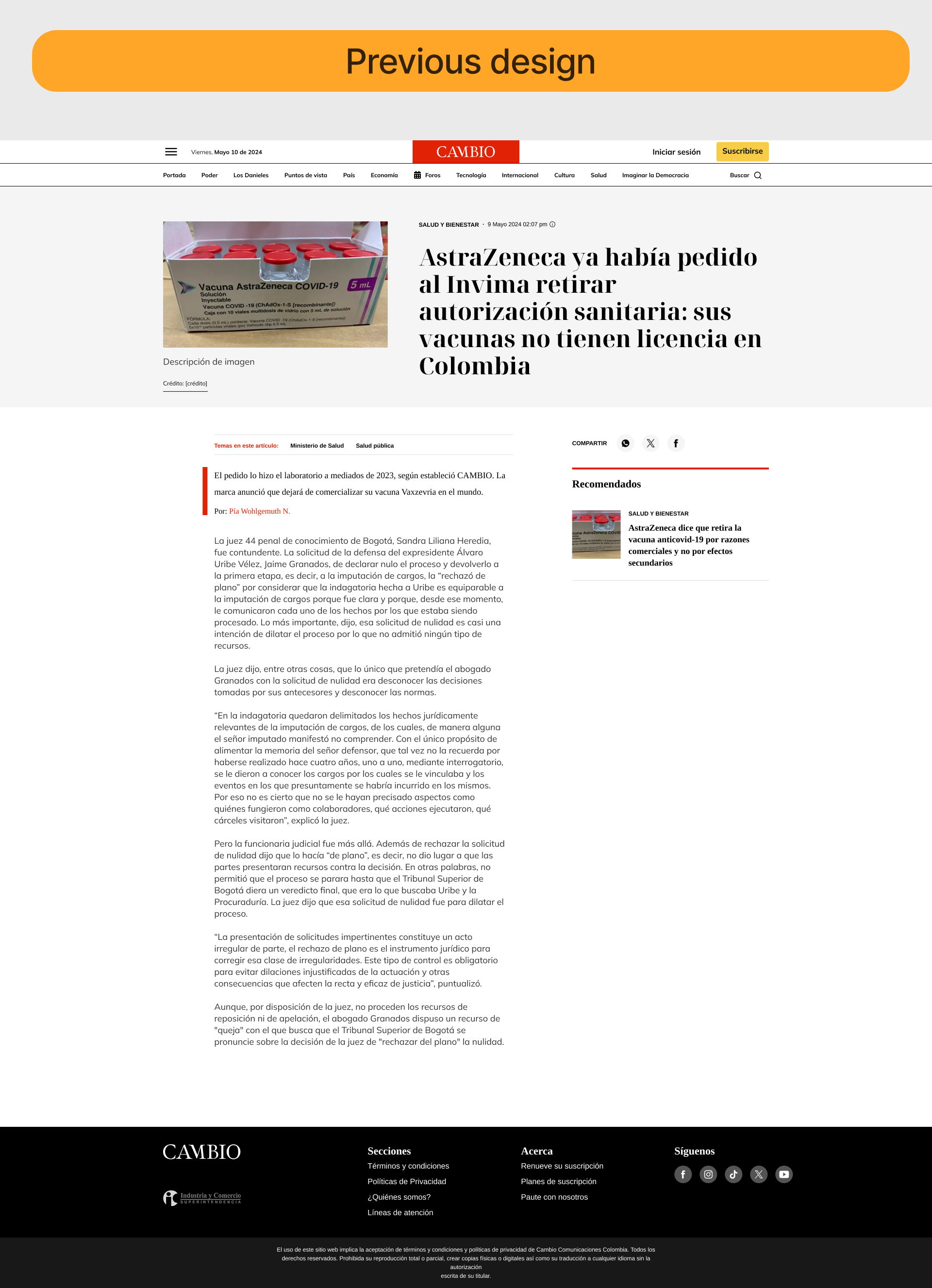
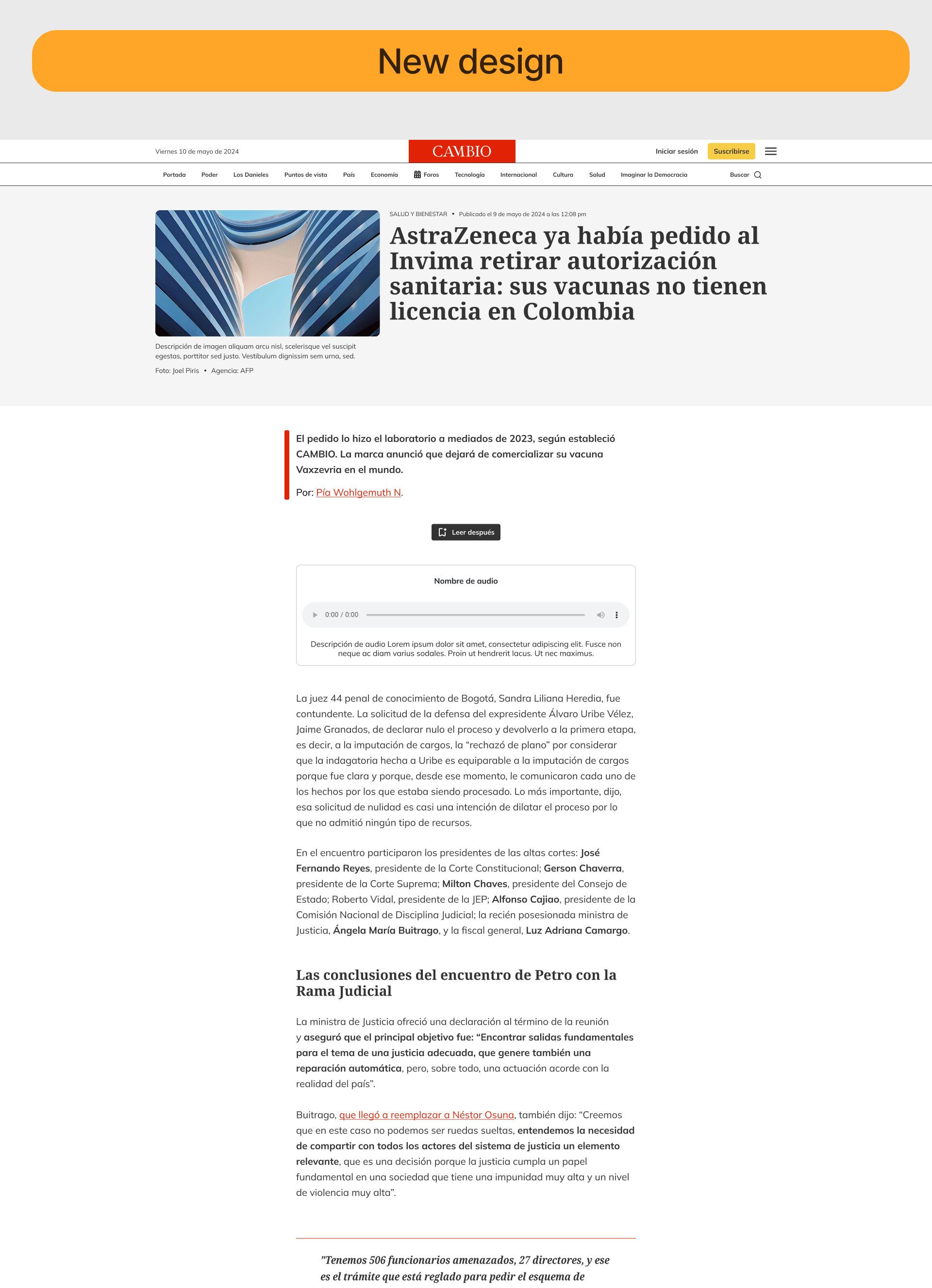
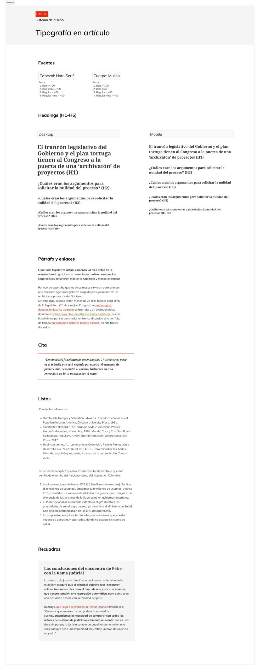
Article
Article pages were redesigned to improve readability through typographic adjustments and layout refinements. New features were introduced, such as save for later and listen to article. Additional components were added, including quotes, highlight boxes, multiple image sizes for visual impact, and related articles.
Design review workshops
The proposed UI changes were presented in a series of collaborative design review sessions with stakeholders, including journalists, editorial leads, marketing, and management. Each component and design change was explained with its rationale, followed by time for participants to leave feedback using comments and post-its.
This process helped validate decisions early and led to several small refinements before implementation.
Design review workshop excerpt
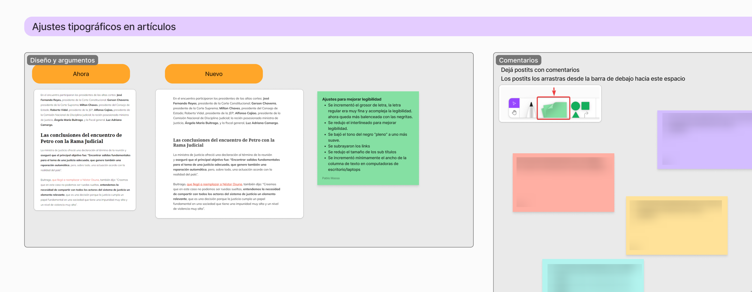
Workshops were conducted using FigJam and Google Meet
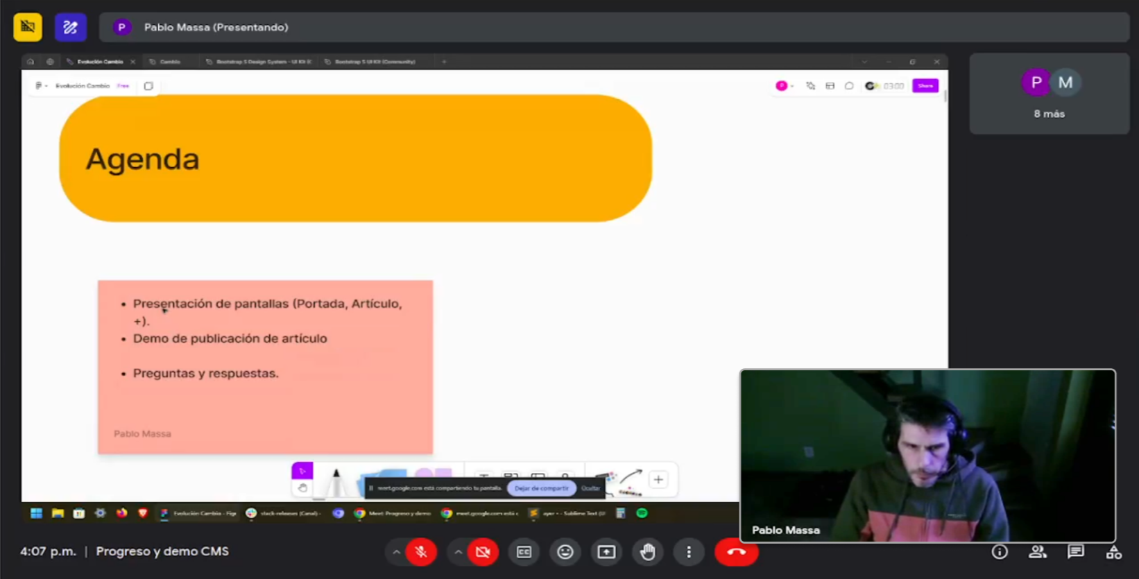
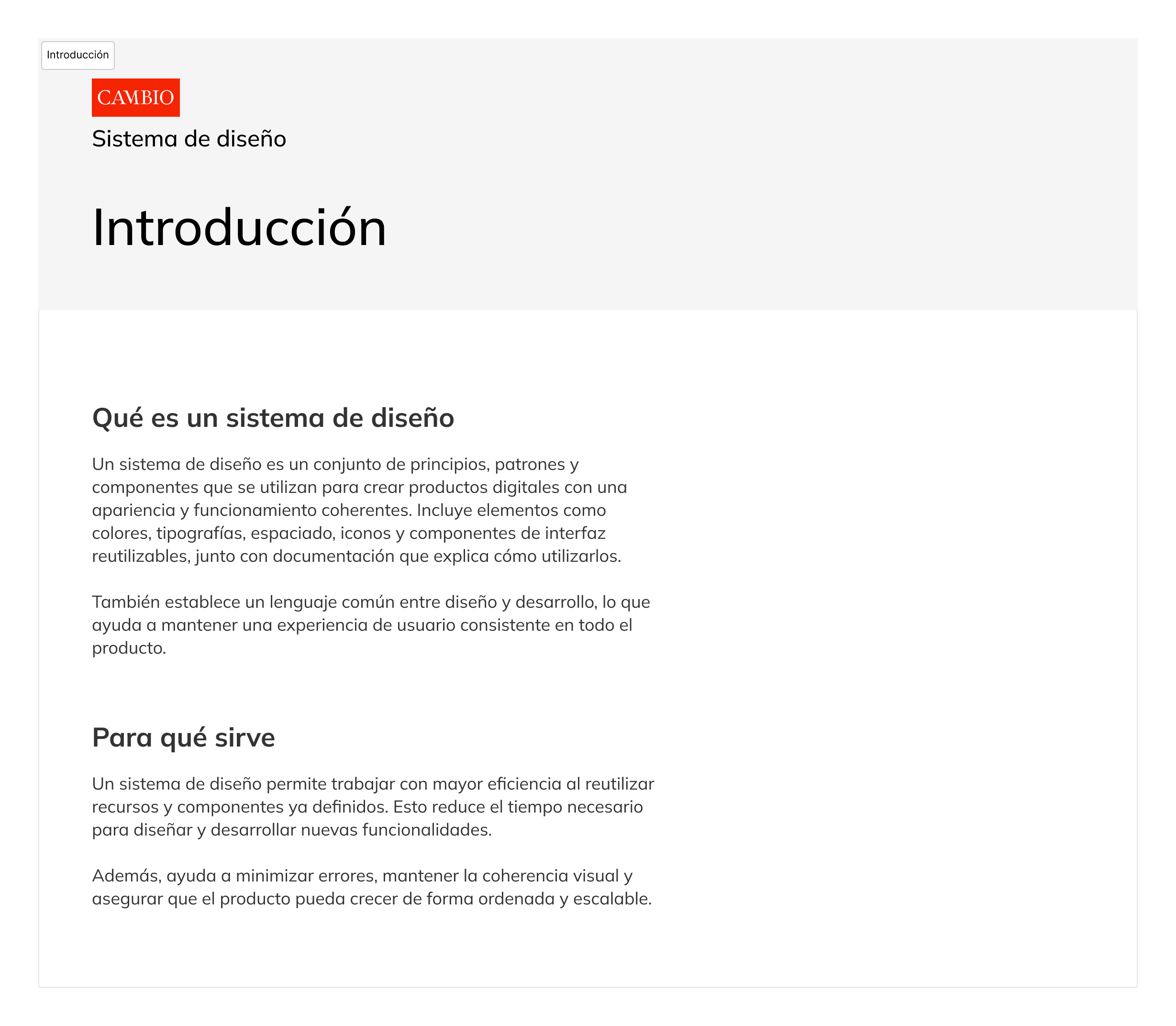
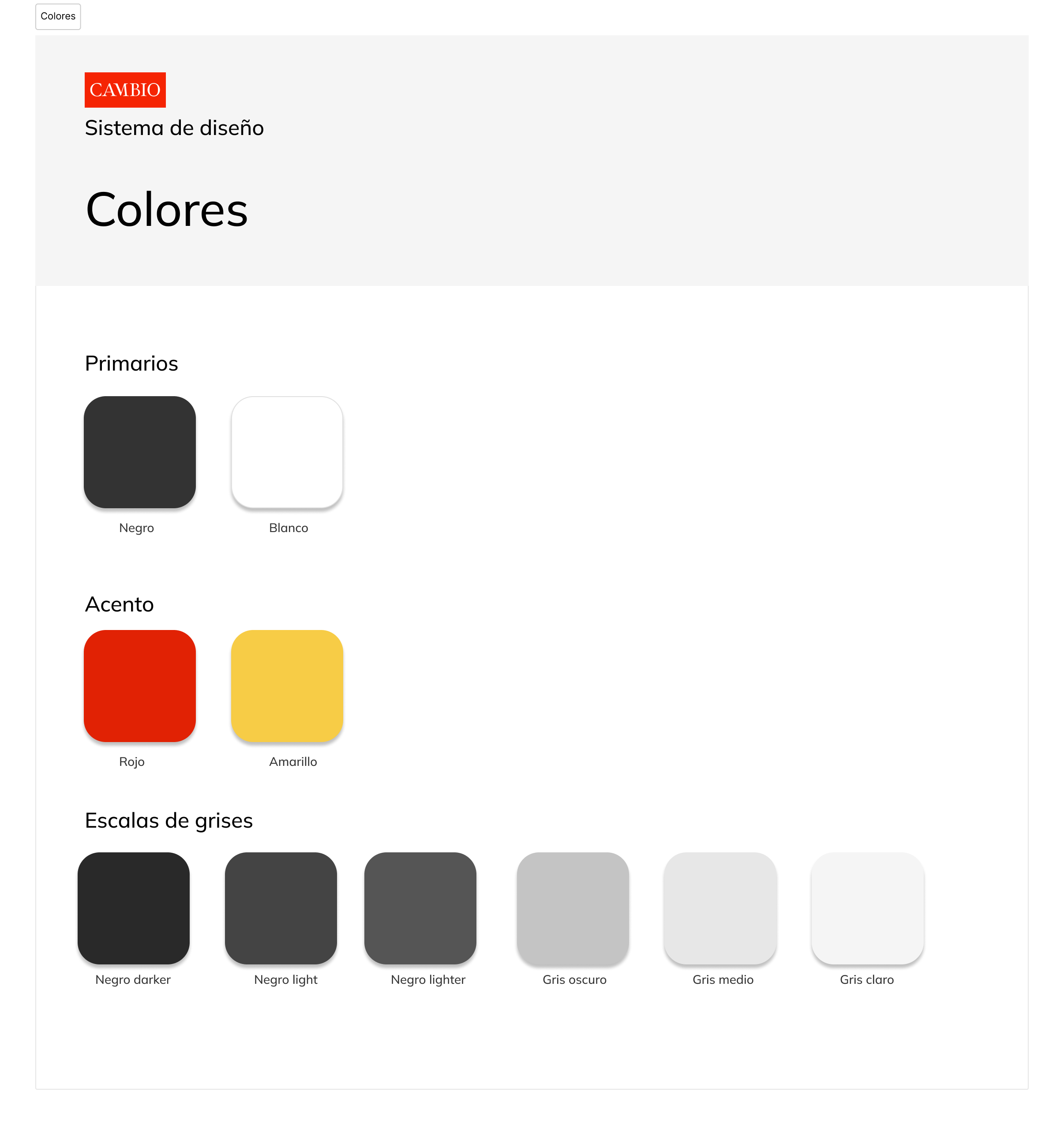
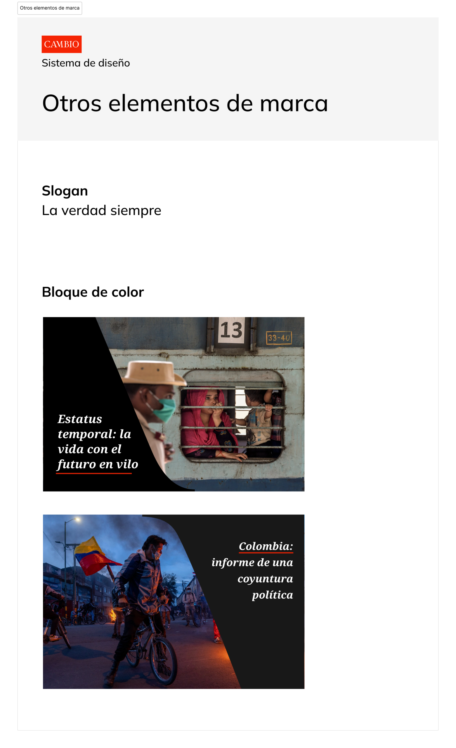
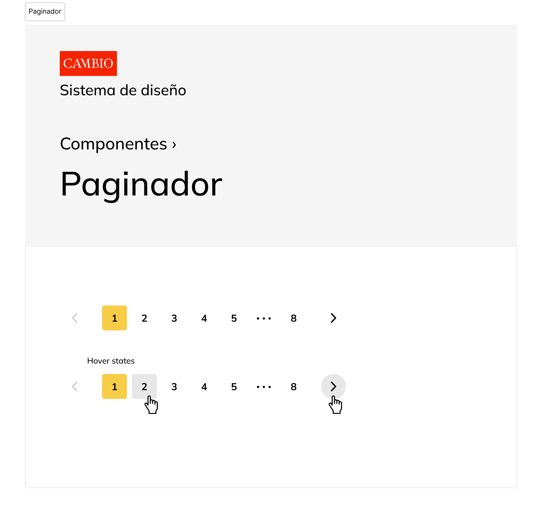
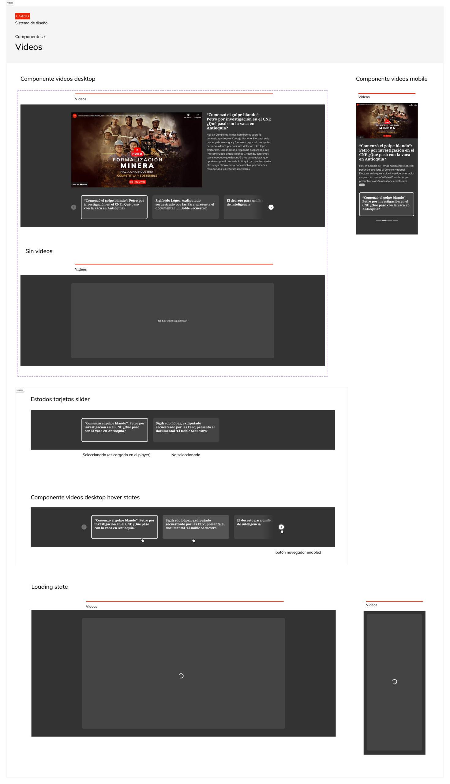
4) Design system and screens
The product did not have a design system, so I created and documented one to enable faster implementation and consistent UI across user facing pages. Based on this system, I designed more than 50 high fidelity screens in Figma, applying the new components and patterns while introducing several UI refinements and full page redesigns across the product.
Deliverables
- Tokens and foundations (type scale, spacing, colors)
- Component library with states and responsive behavior
- Documentation for implementation and QA
- 50+ high fidelity screens using Auto Layout, variables, and other advanced features
Implementation and collaboration
I maintained a tight loop with engineering to ensure feasibility and delivery quality.
How we worked
- Regular syncs with frontend and backend on constraints and data states
- Stakeholder reviews with editorial, SEO, marketing, and sales for content rules and business requirements
- Design QA during implementation to validate spacing, states, and responsive behavior
- Documentation for edge cases, redirects, login continuity, and paywall rules
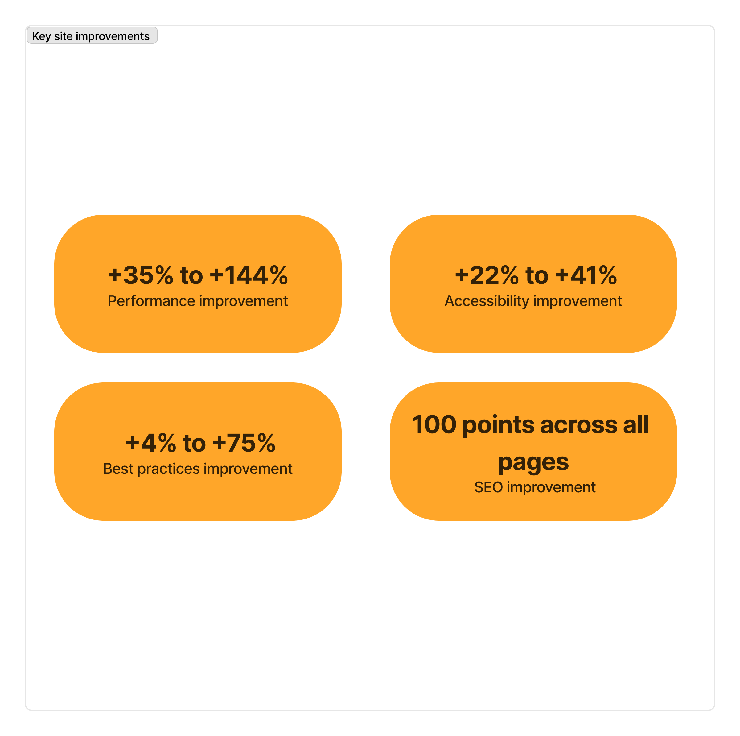
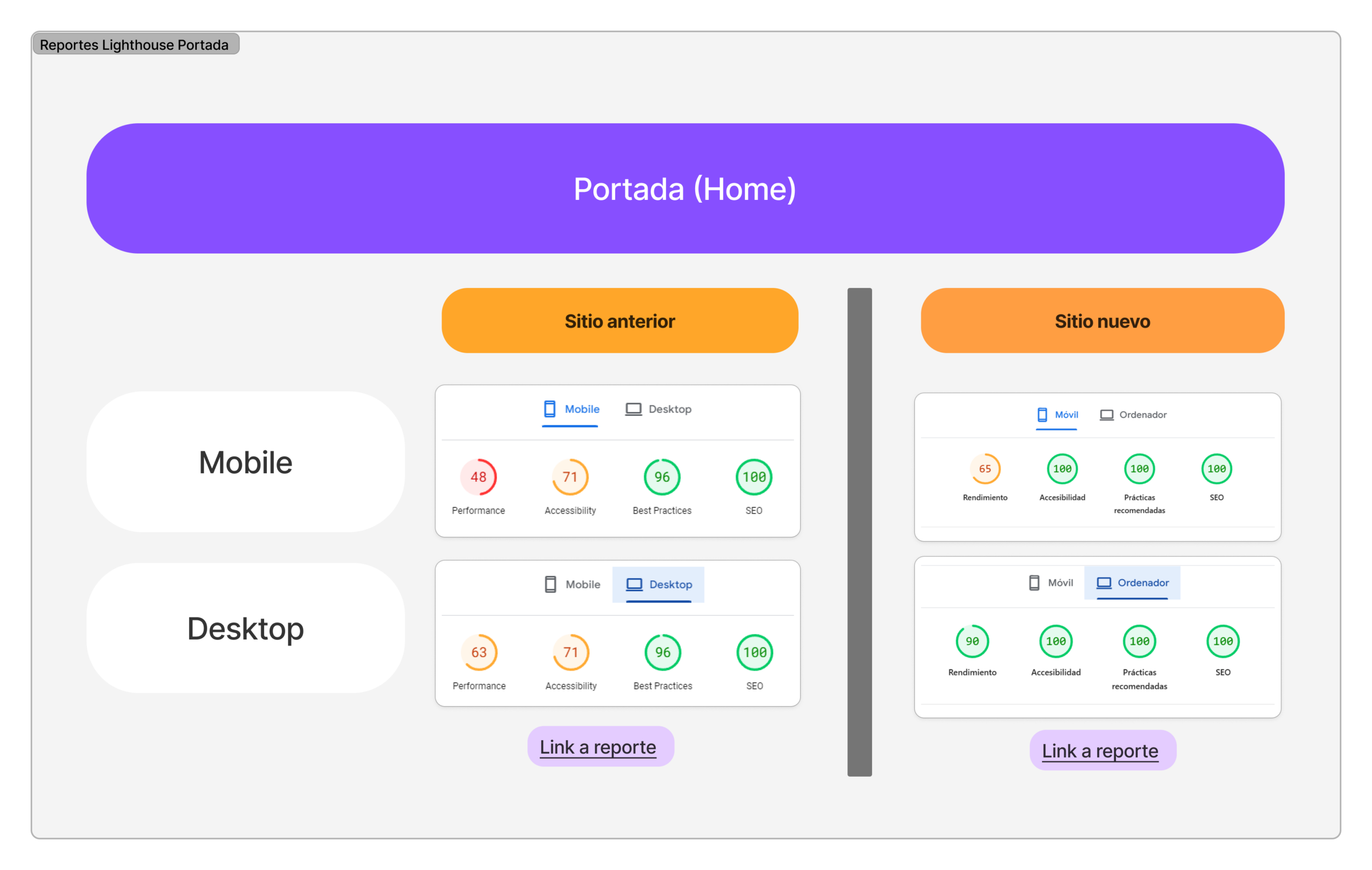
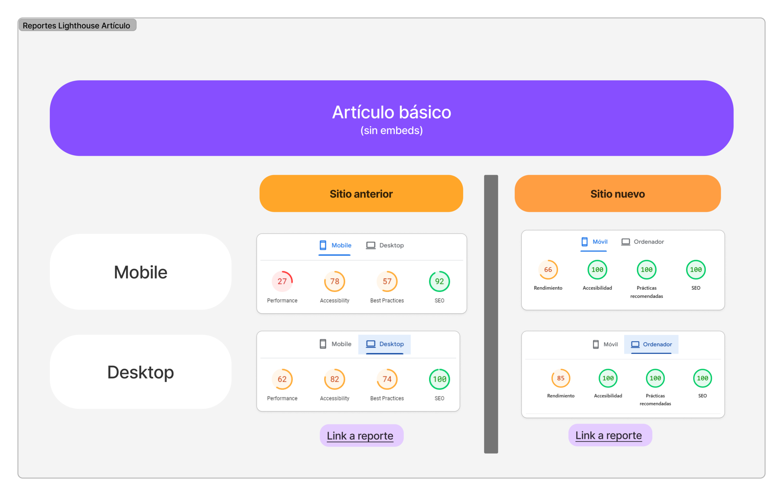
Outcomes
The project established a more scalable and maintainable product foundation, improving performance, reducing complexity, and enabling clearer ownership across the platform.
Key outcomes
Business impact
- Reduced costs by eliminating multiple third party SaaS tools and consolidating them into a single platform
- More sustainable and scalable platform to support future growth
Operational impact
- Improved workflows for editorial, sales, and support teams through tool consolidation and clearer processes
- Clearer ownership of user and subscription states within a single platform
- Reduced dependency on fragmented tools and manual processes
Design & product impact
- Improved end user experience and website performance, especially optimizing the subscription flow and payment methods
- Refined UI and brand experience, improving brand positioning and perception
- Established a scalable design system and UI foundation in Figma to enable faster iteration
Learnings
Some lessons from the project that I believe are useful to share.
Design systems require collaboration, not just components
Design systems accelerate development and improve UI consistency, but only when paired with close collaboration between design and frontend. Learning some frontend as a designer, and sharing basic UX principles with developers, significantly improves implementation quality.
AI accelerates output, not judgment
AI tools can accelerate execution across research, design, and development, but without strong direction they tend to produce generic results. Maintaining authorship, critical thinking, and a clear product vision is key to achieving differentiated outcomes and excellence.
Tool sprawl creates operational chaos
Organizations often accumulate third party tools over time. This decentralization leads to fragmentation, duplicated functionality, and rising costs. Promoting tool ownership and consolidation is essential to maintain operational clarity.
Managing risk in large scale migrations
Large migrations require explicit decision logs and clear ownership of risks across SEO, authentication, payments, and data. When a site is already in production, it is critical to plan in detail, anticipate failure scenarios, and define fallback strategies before executing.
Adapting workshops for editorial teams
Working with journalists and editorial teams requires adapting the design process. Studying the domain, avoiding technical language, and keeping discussions focused on content and readers leads to more productive workshops.
Be critical with SEO advice
The SEO industry contains a large amount of hype and short lived tactics. Many recommendations offer negligible gains or quickly lose relevance. It is important to evaluate advice critically and prioritize sustainable improvements over marginal optimizations.
Thanks for reading
Note
My English level is Upper Intermediate. This case study was written with assistance from ChatGPT for proofreading, wording, and sentence structure.
Many screenshots and assets appear in Spanish, as translating them would have required significant additional work. I believe the visuals still communicate the design and process clearly.